EVA Pharma – Powerful Visual Storytelling for Everyday Health.
This campaign was created for EVA Pharma, one of the leading pharmaceutical companies in the MENA region.
The goal was to promote two essential products through bold, relatable visual narratives:
This campaign was created for EVA Pharma, one of the leading pharmaceutical companies in the MENA region.
The goal was to promote two essential products through bold, relatable visual narratives:
Asobadol – A fast-acting painkiller that helps stop moderate to severe pain before it takes over.
Milga – A B12-based supplement designed to support nerve health, energy levels, and focus.
Each campaign tackles its target audience's real pain points—whether it's the intense physical pressure of a headache or the mental and physical fatigue from weakened nerves.
We created a storytelling approach that connects emotionally with the viewer while remaining grounded in product benefit.
We created a storytelling approach that connects emotionally with the viewer while remaining grounded in product benefit.
"Don’t Let Pain Take Over"
We all know what pain feels like—but what if we could visualize it in a dramatic, humorous, surreal way?
The concept is built on visual exaggeration of how pain invades your body and mind.
Each scene turns pain into a literal, absurd metaphor:
We all know what pain feels like—but what if we could visualize it in a dramatic, humorous, surreal way?
The concept is built on visual exaggeration of how pain invades your body and mind.
Each scene turns pain into a literal, absurd metaphor:
It eats your brain
It drums in your head
It drains your energy
And the answer?
Asobadol. Fast, effective, and targeted relief.
Asobadol. Fast, effective, and targeted relief.


Visual Style: Surreal 3D cartoon characters
Tone: Bold, humorous, exaggerated
Color Palette: Strong reds and blues to reflect urgency, tension, and relief
Imagery: Literal visual metaphors of pain—humans transformed to show the impact of pain
Typography: Sharp, condensed Arabic type with motion effects reflecting speed & strength
This style grabs attention immediately, educates through metaphor, and keeps the viewer entertained and informed.
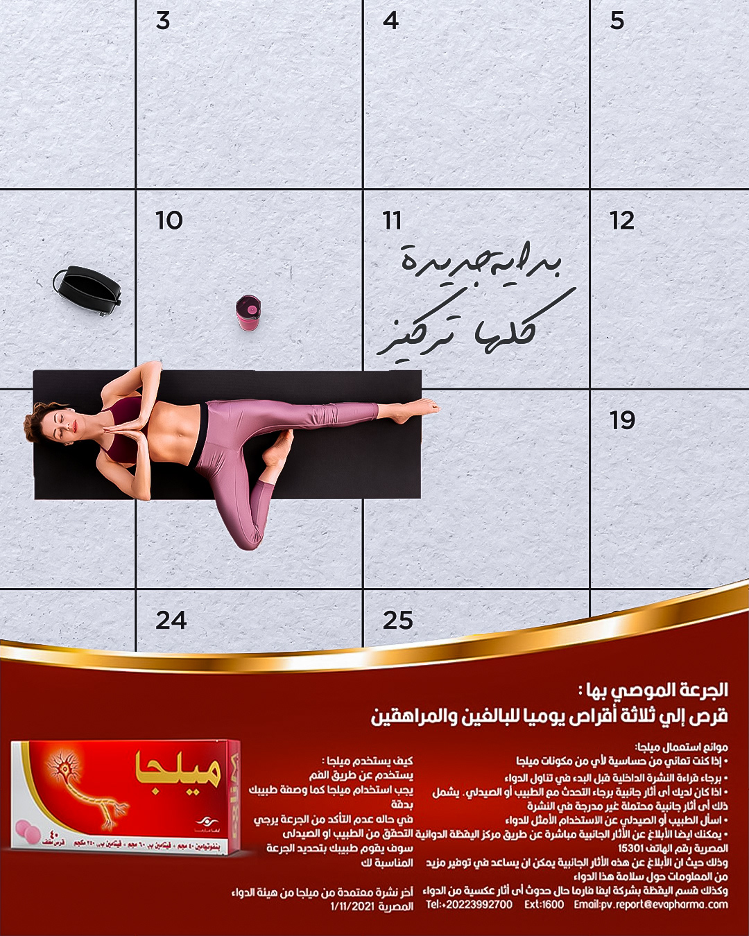
"A New Start with Stronger Nerves"
Milga isn’t just about treating nerve fatigue—it’s about reclaiming your day.
This campaign revolves around the calendar as a symbol of new beginnings.
Each day is a fresh opportunity to feel stronger, more focused, and full of energy.
Milga isn’t just about treating nerve fatigue—it’s about reclaiming your day.
This campaign revolves around the calendar as a symbol of new beginnings.
Each day is a fresh opportunity to feel stronger, more focused, and full of energy.
From morning routines to exercise, concentration, and productivity—Milga supports your nervous system to help you live life at your full potential.
Visual Style: Top-down flat photography + graphic overlays
Tone: Clean, calm, fresh
Color Palette: White & light gray base + vibrant action accents (red, blue, green, orange)
Imagery: Real-life scenes on a calendar grid—symbolizing structured routines and personal progress
Typography: Handwritten Arabic style to reflect personalization and human touch
This style connects with health-conscious individuals who want structure, balance, and energy in their day.


Health isn’t just about treatment—
It’s about reclaiming your power.
Which story spoke to you most?
Let me know in the comments 💬💊⚡
It’s about reclaiming your power.
Which story spoke to you most?
Let me know in the comments 💬💊⚡

