Core idea
Brand identity, packaging & product imageryCase 09
Wabi
Brand identity, packaging and product imagery for a premium Kuwaiti tissue brand.

Brief
Build Wabi from the ground up across tissues and wet wipes in different sizes and formats. The client had chosen the name from their interest in wabi-sabi and wanted that Japanese inspiration to feel approachable to customers in Kuwait.
Audience
Customers across Kuwait buying tissues and wet wipes, with Wabi positioned as a premium local brand.
Challenge
A new local brand was entering the market at a premium price. Its presentation needed to communicate care and quality before someone tried the product. I approached the packaging as something people would enjoy keeping in view—an everyday object with an artistic presence.
01The identity
A gesture connected to the product.
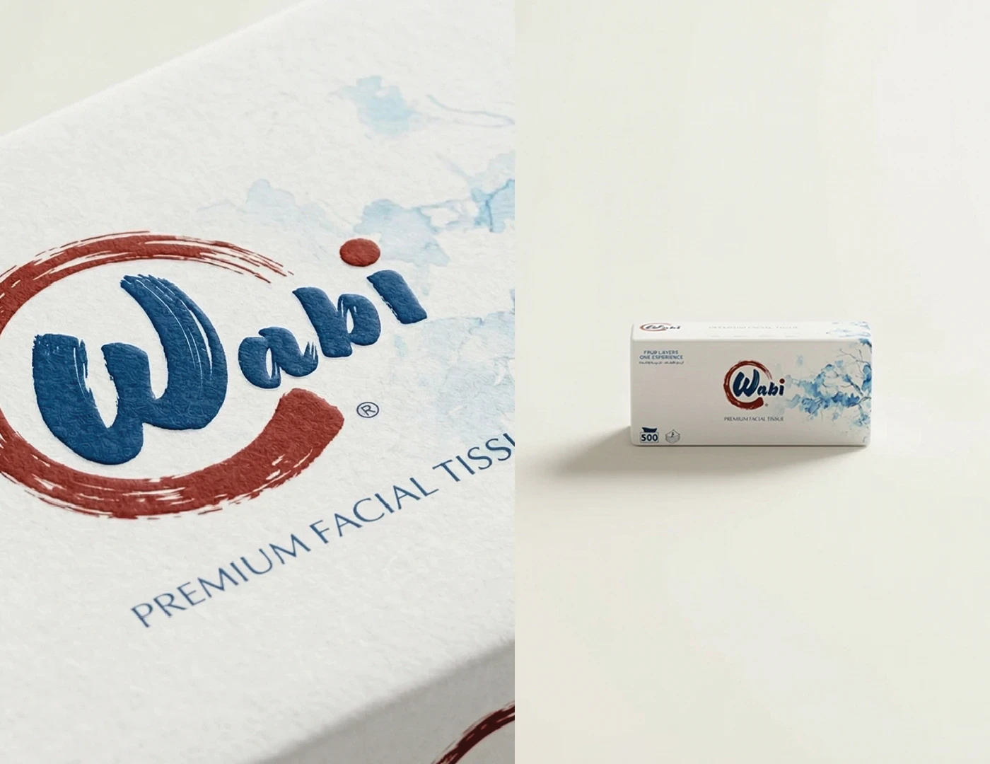
The client wanted an incomplete, Ensō-inspired circle in the logo. I gave the brushwork another connection: the gesture of a tissue wiping across a surface. That small interpretation connected the visual reference to what Wabi actually makes.


02Illustration, colour & typography
Flowers as a familiar connection.
I used flowers to connect the Japanese inspiration with a familiar feeling of softness and delicacy. I painted the watercolour illustrations myself, making their visible brushwork part of the identity. The palette supported the chosen direction, while clear typography kept the information accessible across English and Arabic.


03The packaging system
One family, different expressions.
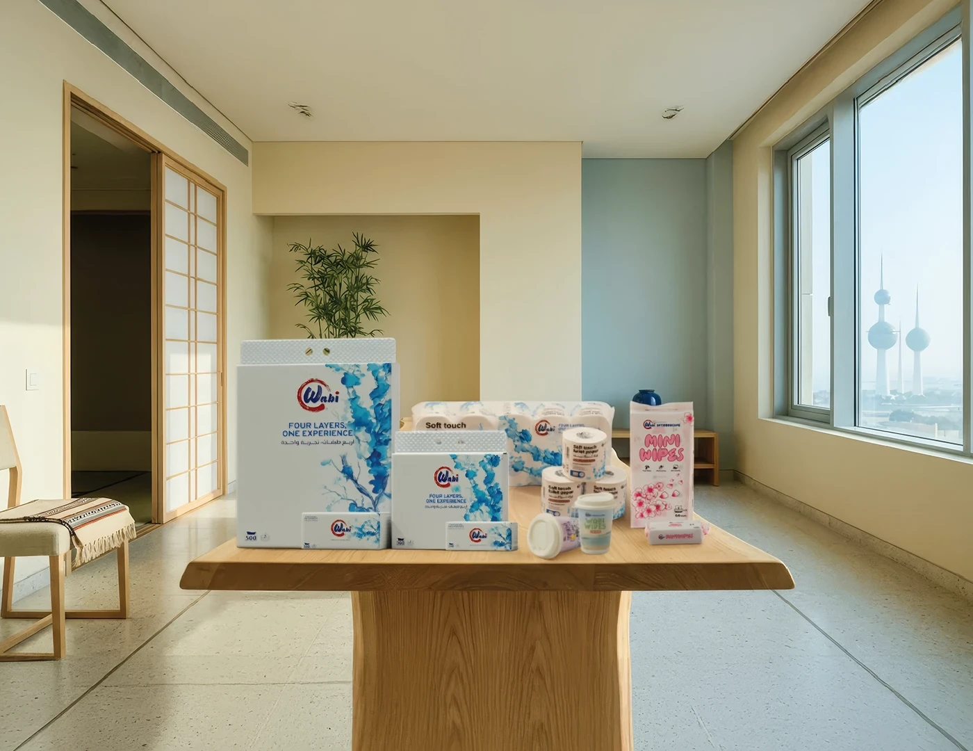
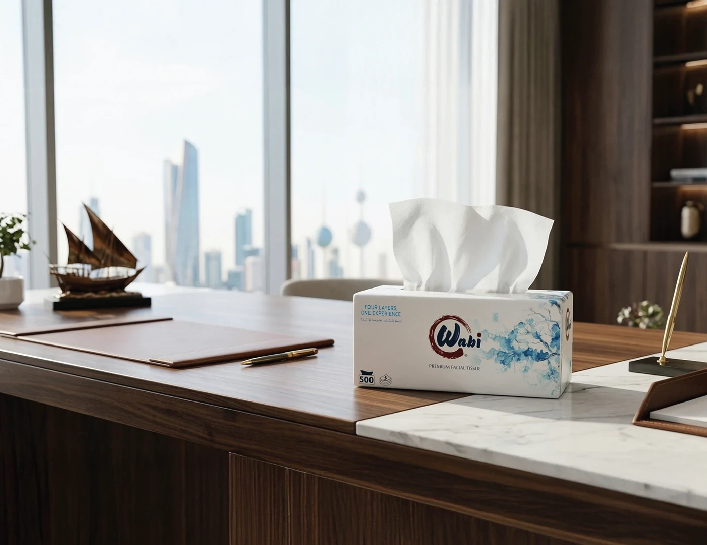
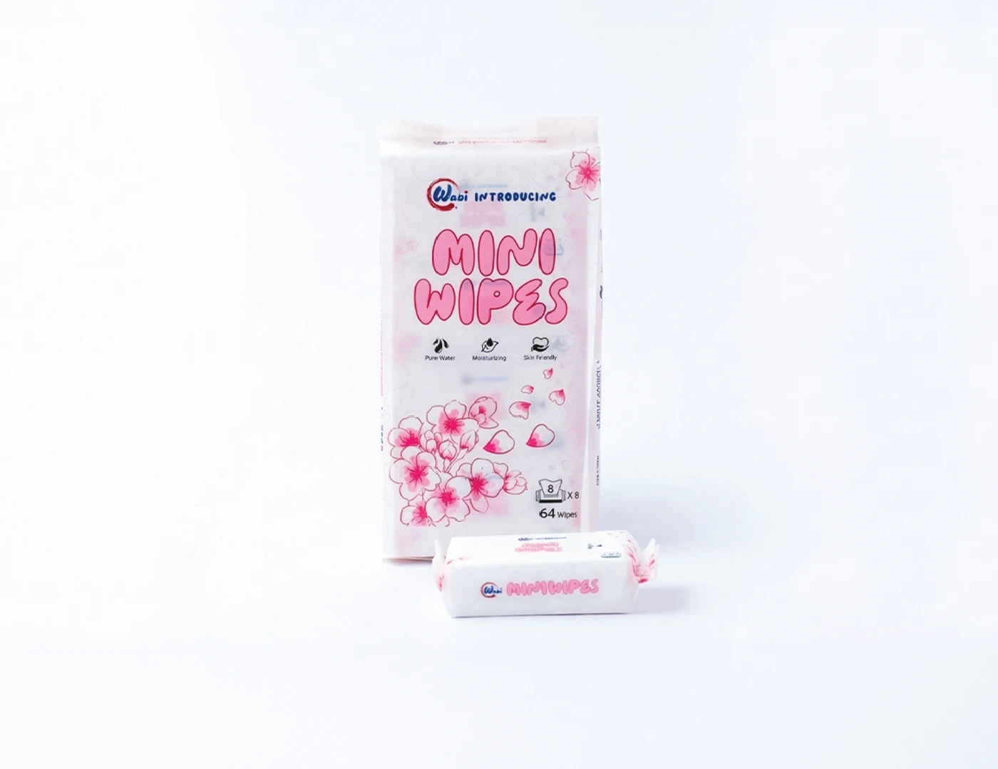
The packaging followed a consistent visual approach, with variations in colour and illustration giving individual products their own character. I adapted the hierarchy to each format: colour attracts attention, the name and logo establish recognition, and the message and product information complete the reading. The tissue range’s line—«أربع طبقات، تجربة واحدة» / “Four layers, one experience”—connected its construction with the brand’s positioning around quality and value.


04Artwork & dielines
Designed for production.
I developed the packaging artwork and dielines using dimensions supplied by the factory. The identity had to work across the actual proportions of each product, carrying the same character from compact wipe packs to larger tissue formats. The packaging was manufactured and the work moved into real use.


05Product imagery & motion
Photographing the finished work.
I photographed the physical products myself, then cut out the images and built the final compositions around them. This carried the art direction beyond the printed pack into the way the range was presented. I also created the animation using Higgsfield, extending the visual language into motion.




06Product & context
The direction in everyday use.
The same creative direction connected the original reference, the manufactured products and their final imagery.




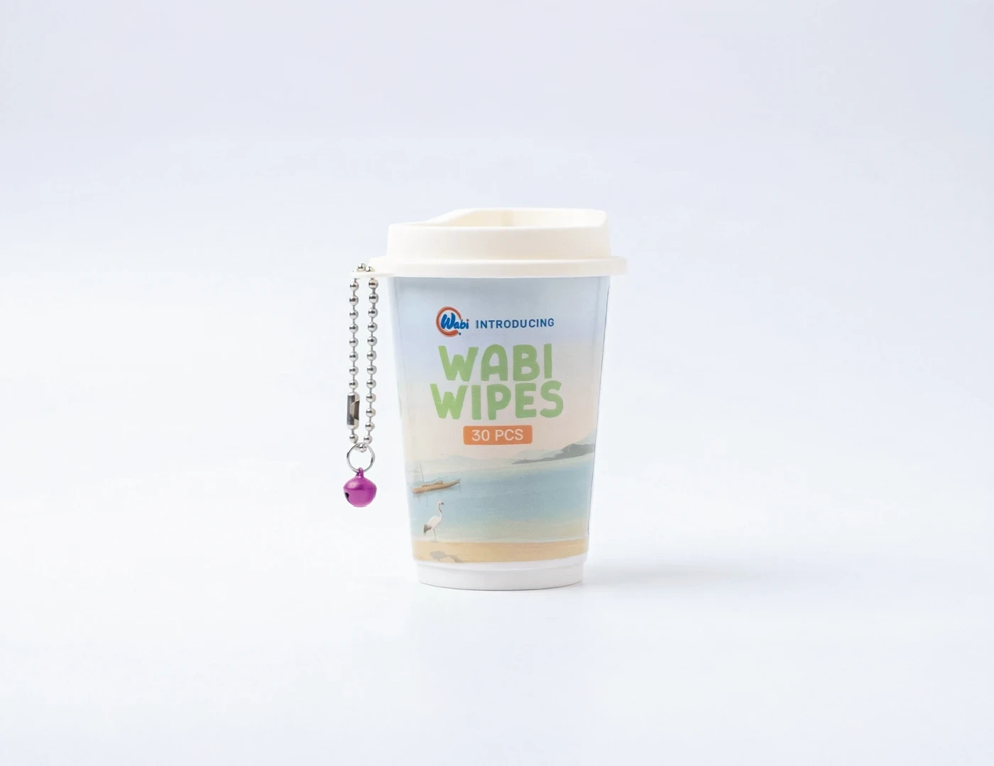
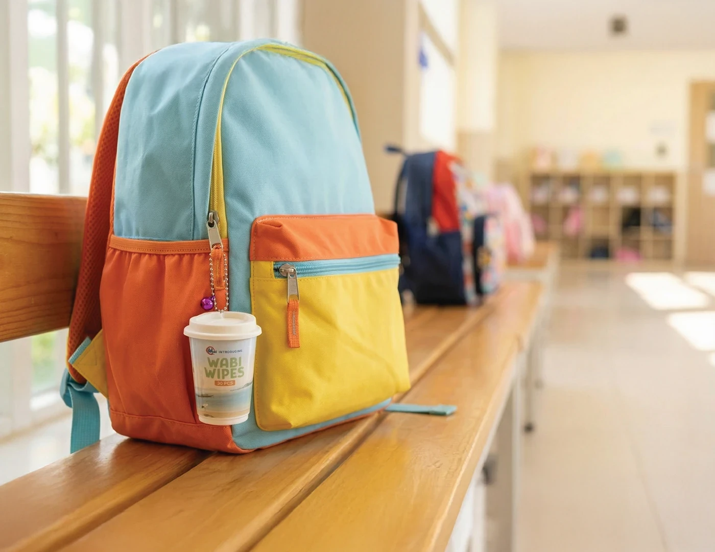
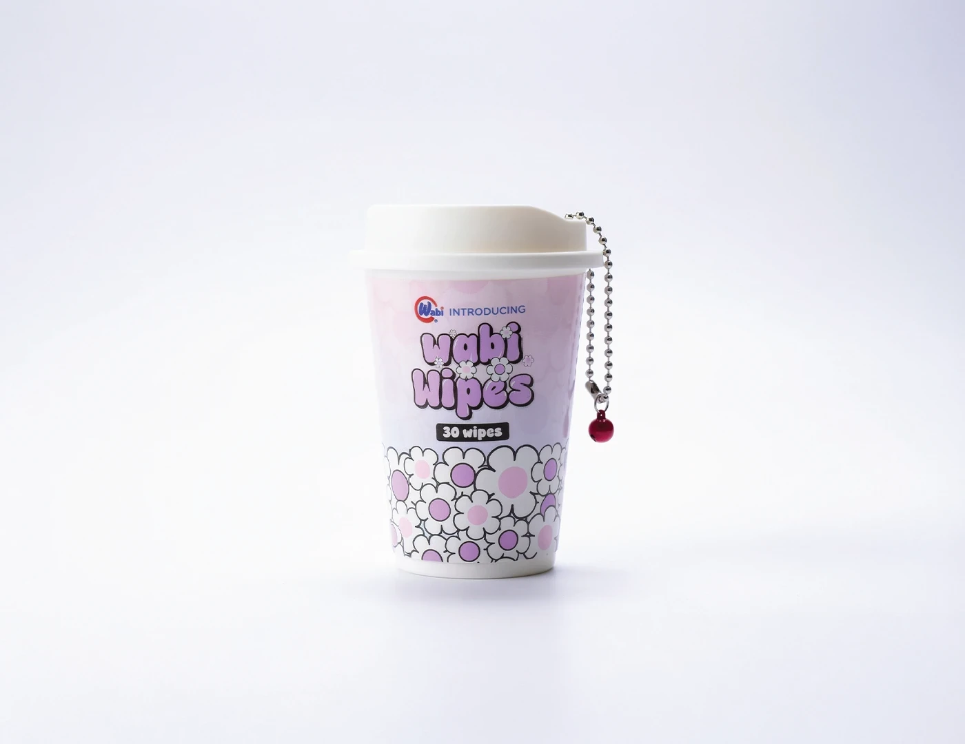

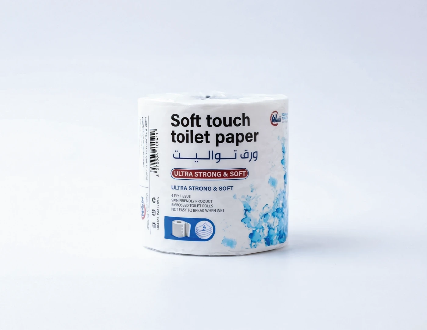


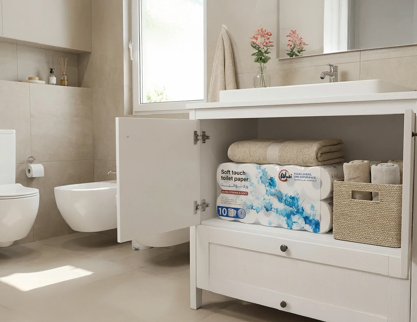


I worked independently across concept development, logo design, colour and typography, original watercolour illustration, packaging design, dielines, product photography, image compositing, social media design and AI animation.
Independent art direction, brand identity, illustration, packaging & photography
- Logo, colours & typography
- Original watercolour illustrations
- Packaging artwork & dielines
- Product photography & image compositing
- Social media design
- AI animation
- Art direction, identity, illustration, packaging, photography and visual content
- Ahmed Sallam
The identity and packaging were implemented, and Wabi’s products are available through the brand’s official online store.
Have a project worth making properly?
yasas77889@gmail.com ↗