A luxury Saudi cake rebrand turning dough movement, a monochrome system and a real product photoshoot into an identity that expresses the person who chose it.
Client
ENZO Cakes & Sweets
Market
Saudi Arabia
Work period
2025
Portfolio release
2025
My role
Independent Rebrand, Identity, Packaging & Photoshoot Art Direction
Rebrand an existing Saudi cake specialist so its identity communicates the luxury behind its higher price point, imported ingredients and specially handcrafted touches. ENZO needed to look as considered as its product while remaining ready to grow from a cloud kitchen into a future physical branch.
Target
Increase ENZO's reach and support its sales as a cloud kitchen through a recognisable premium identity, then build a complete system capable of extending into packaging, social media and a future retail location.
Audience
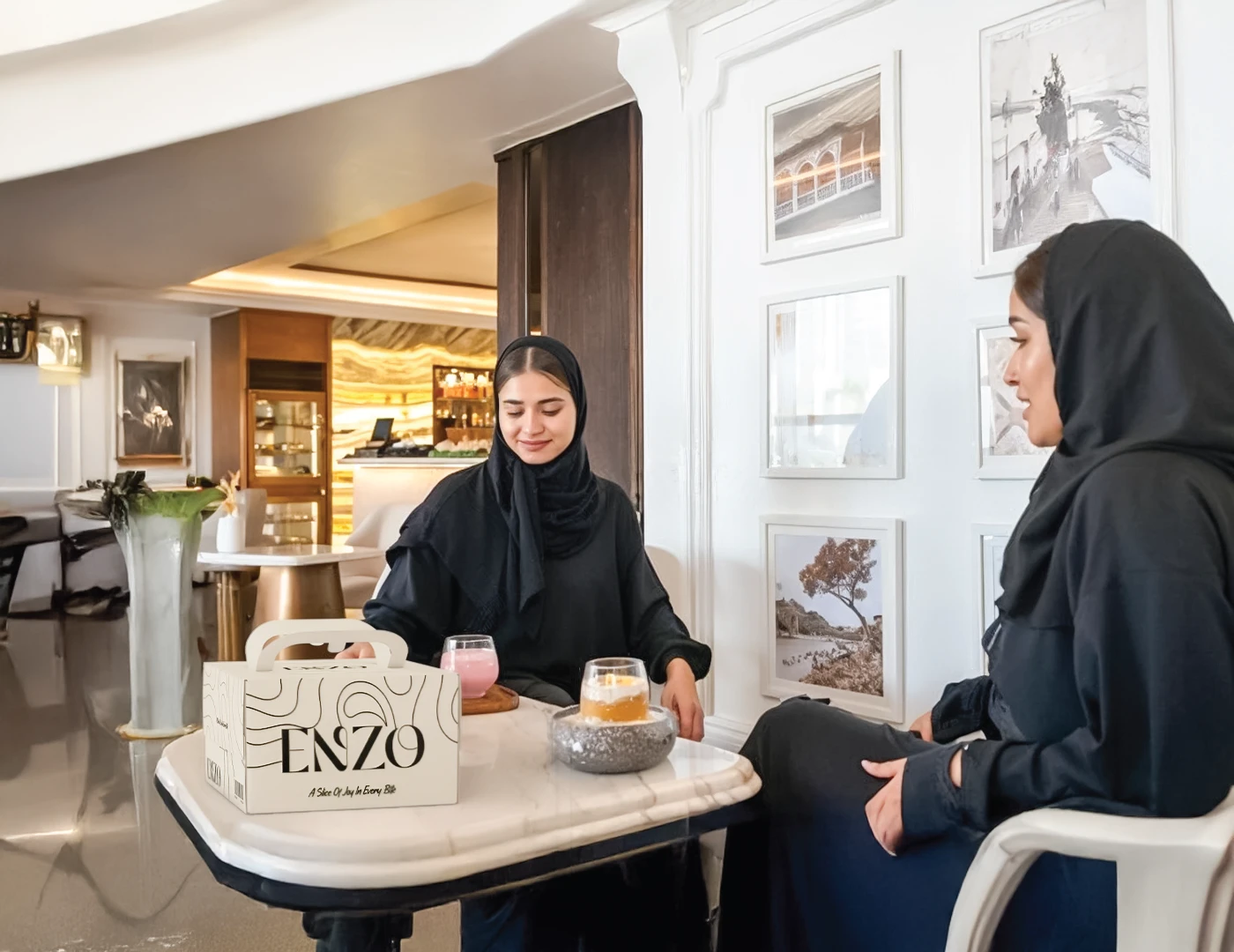
Premium-seeking, status-conscious customers who see the cake they choose as an expression of taste, personality and social presence—not only as a gift.
The work41 source pieces
01The wordmark & the O
From dough to identity.
Art direction
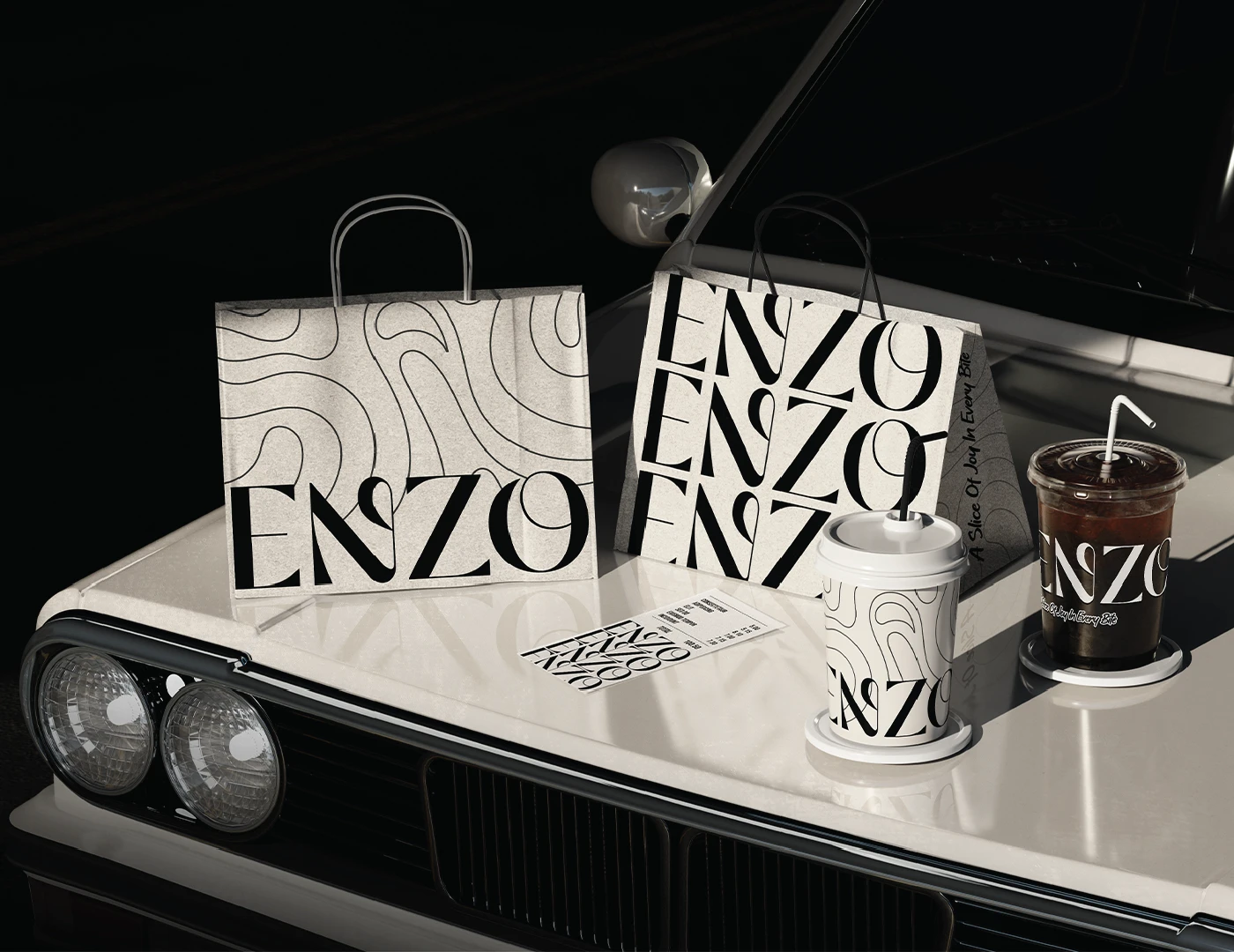
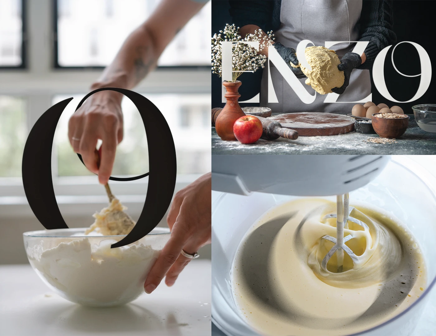
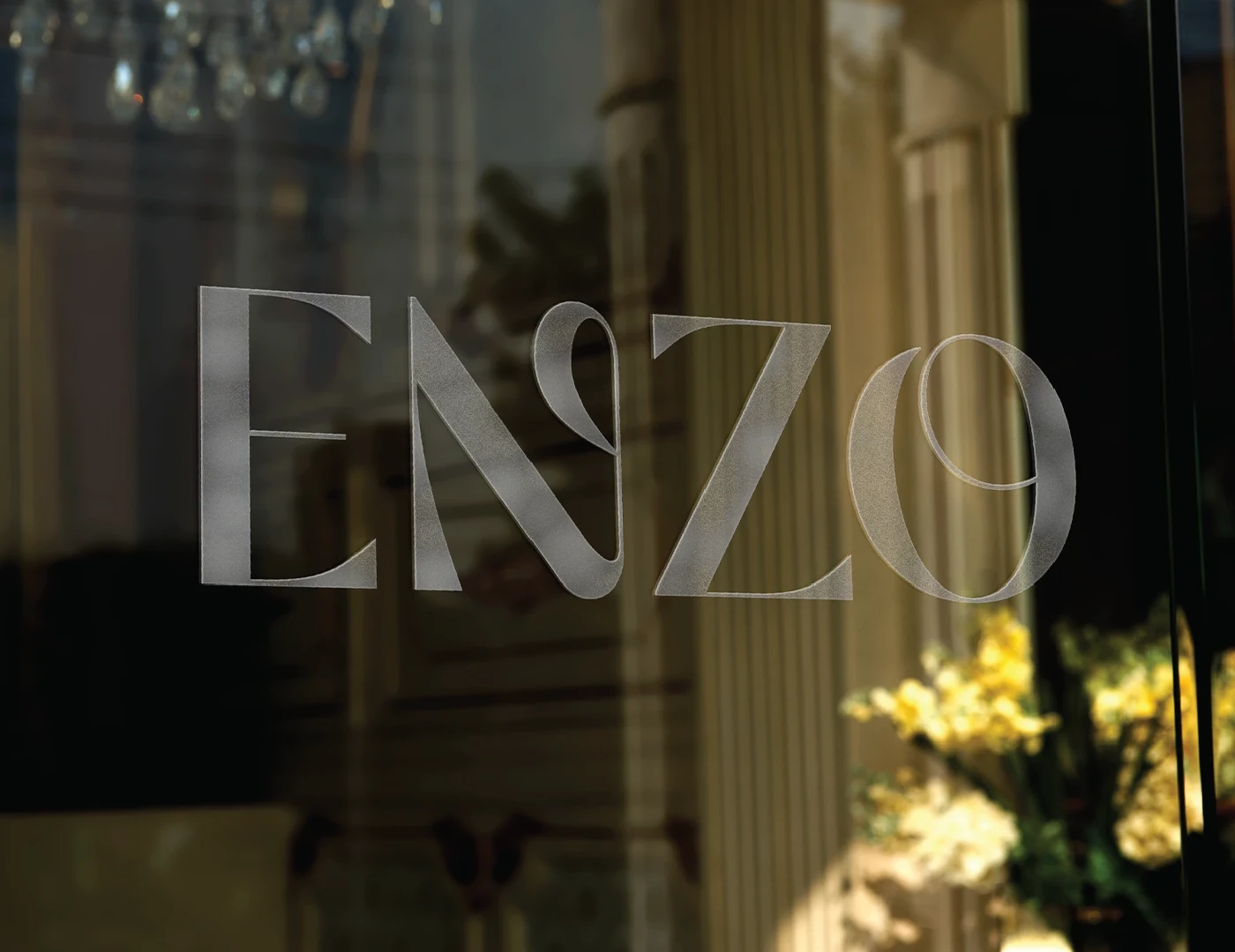
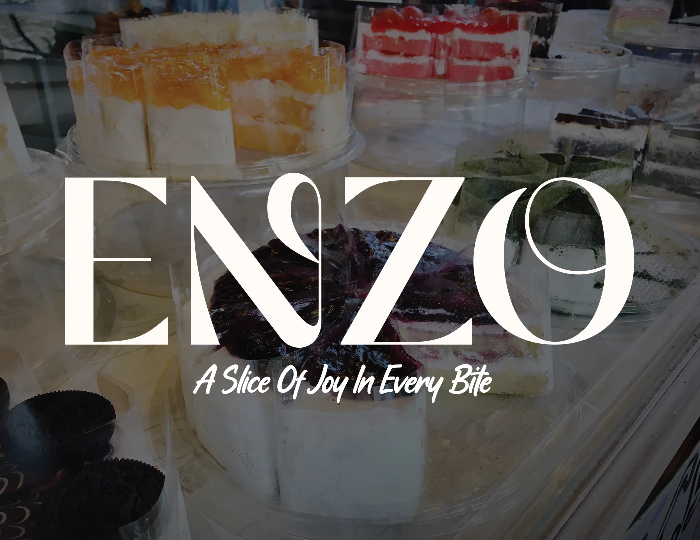
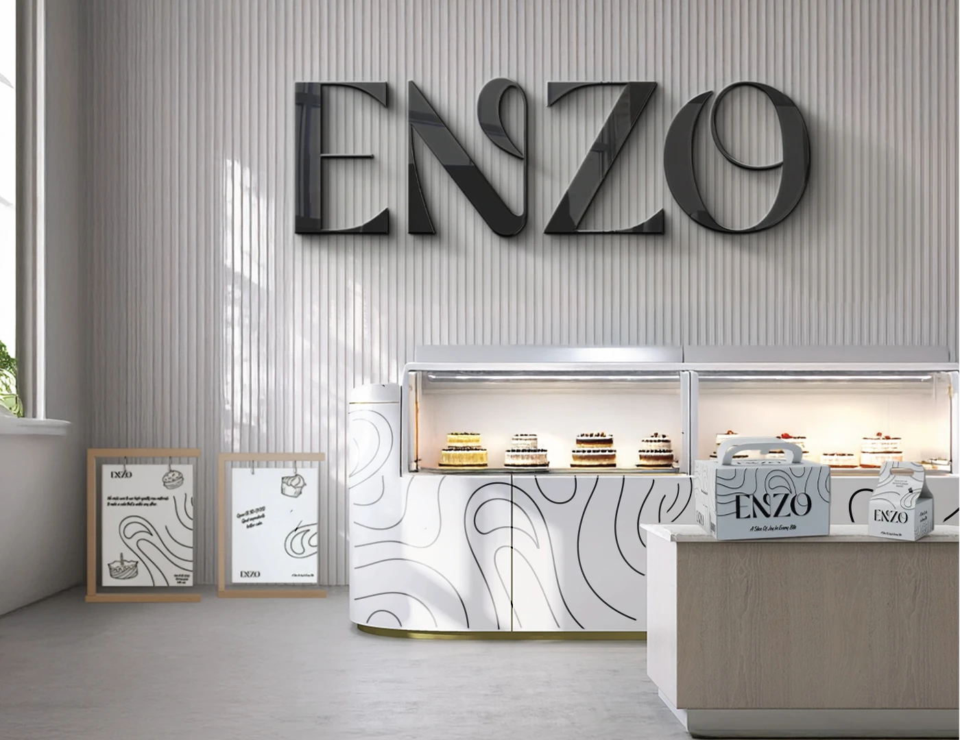
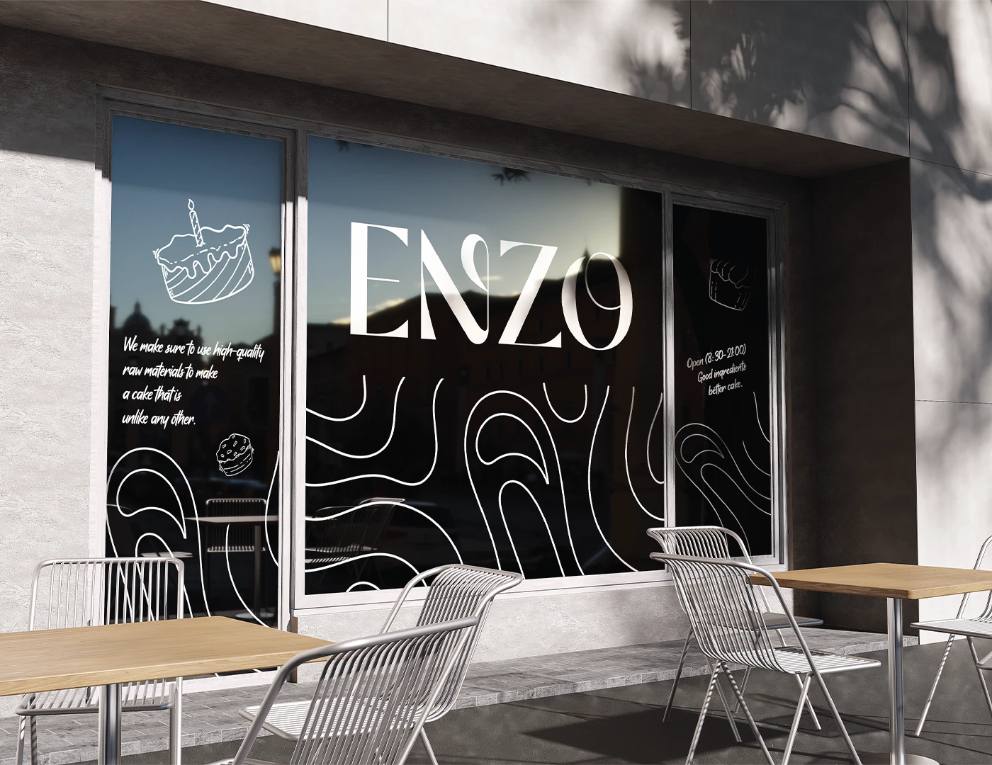
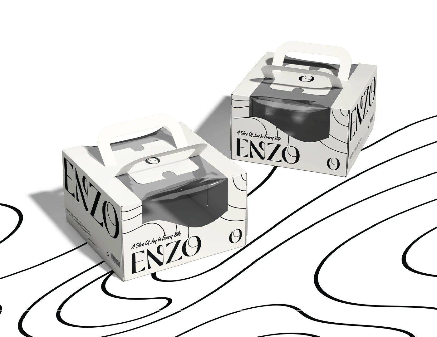
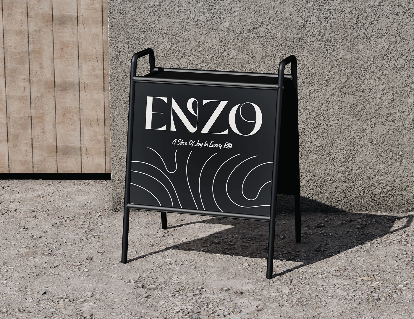
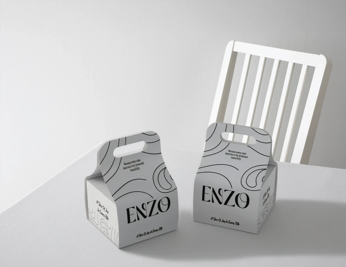
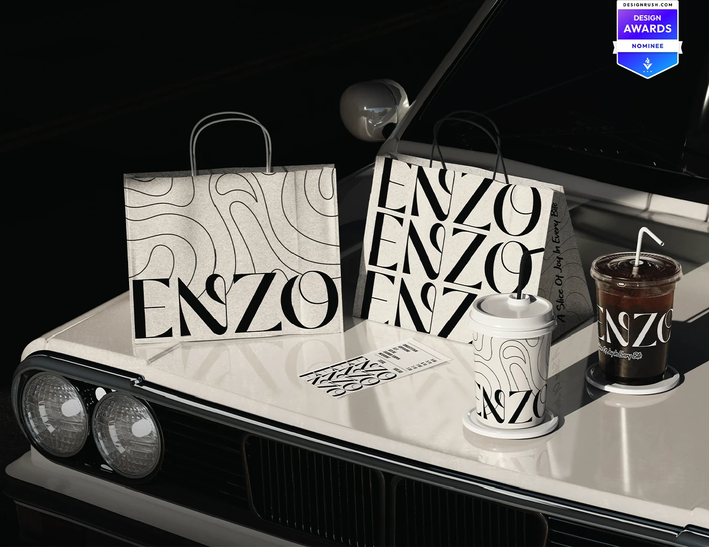
The identity balances classic refinement with a handcrafted edge. The wordmark draws on the flexibility of dough, while the O combines an instinctive 'oh, wow' reaction with the circular movement of a mixture being whisked. A fluid line system carries that motion across the brand. Black and white create a focused, premium frame that lets the cakes' colour, texture and detail remain the visual hero.
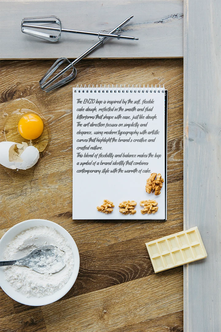
Build the wordmark from the physical flexibility and movement of dough
Give the O a double meaning: an 'oh, wow' response and the circular motion of whisking
02The original brand line
A line for the occasion.
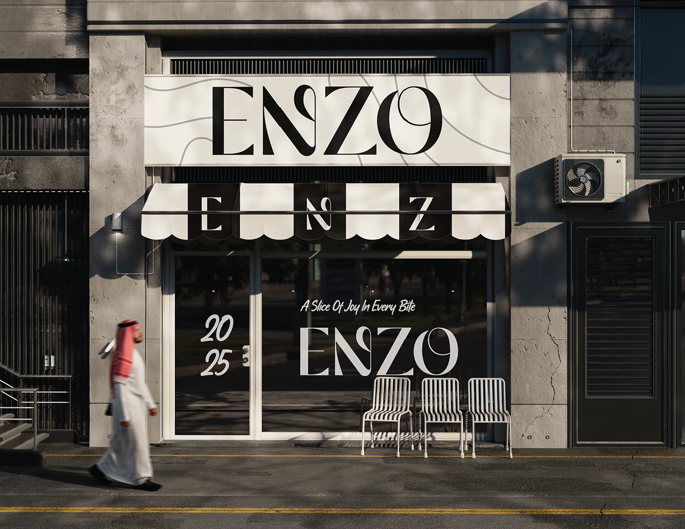
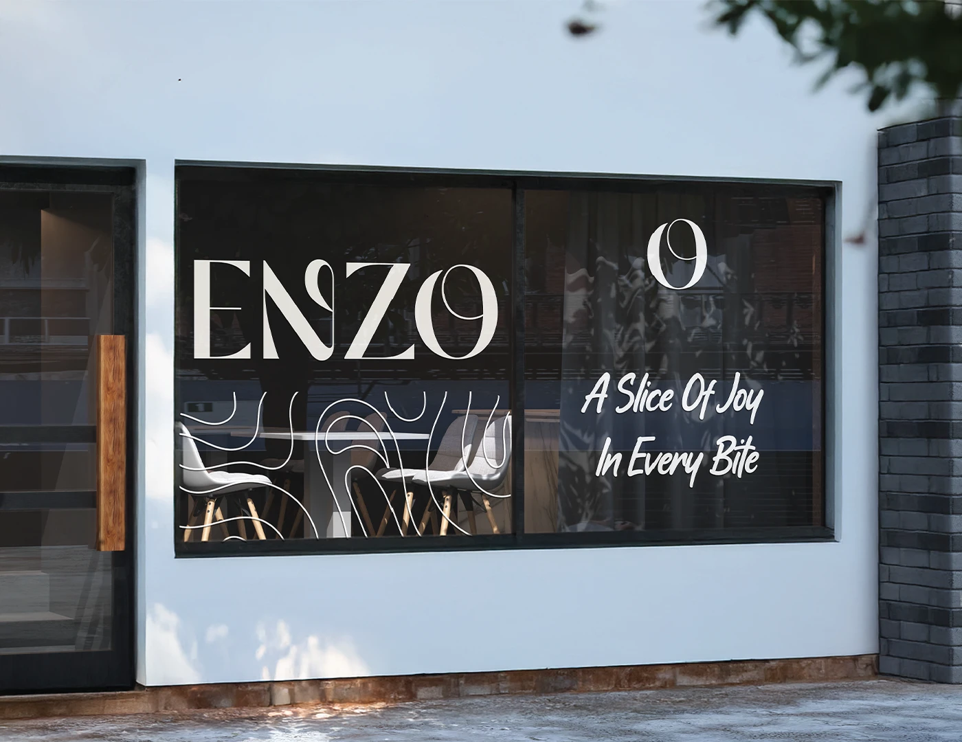
A Slice of Joy in Every Bite.
Written as part of the rebrand, the line gives ENZO a simple emotional promise alongside its elevated visual character: the identity communicates craft and luxury, while every slice returns the focus to the pleasure of the product itself.
03Pattern, illustration & typography
One graphic language. Two scripts.
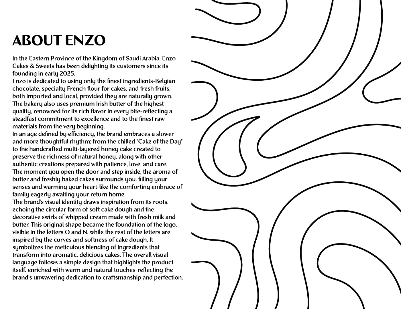
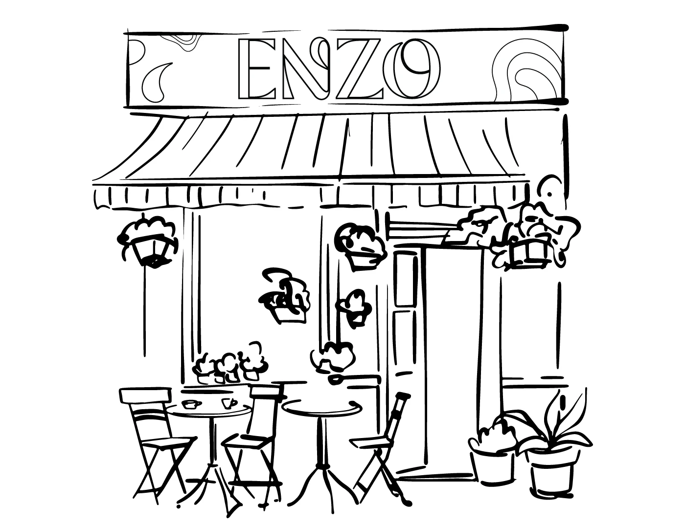
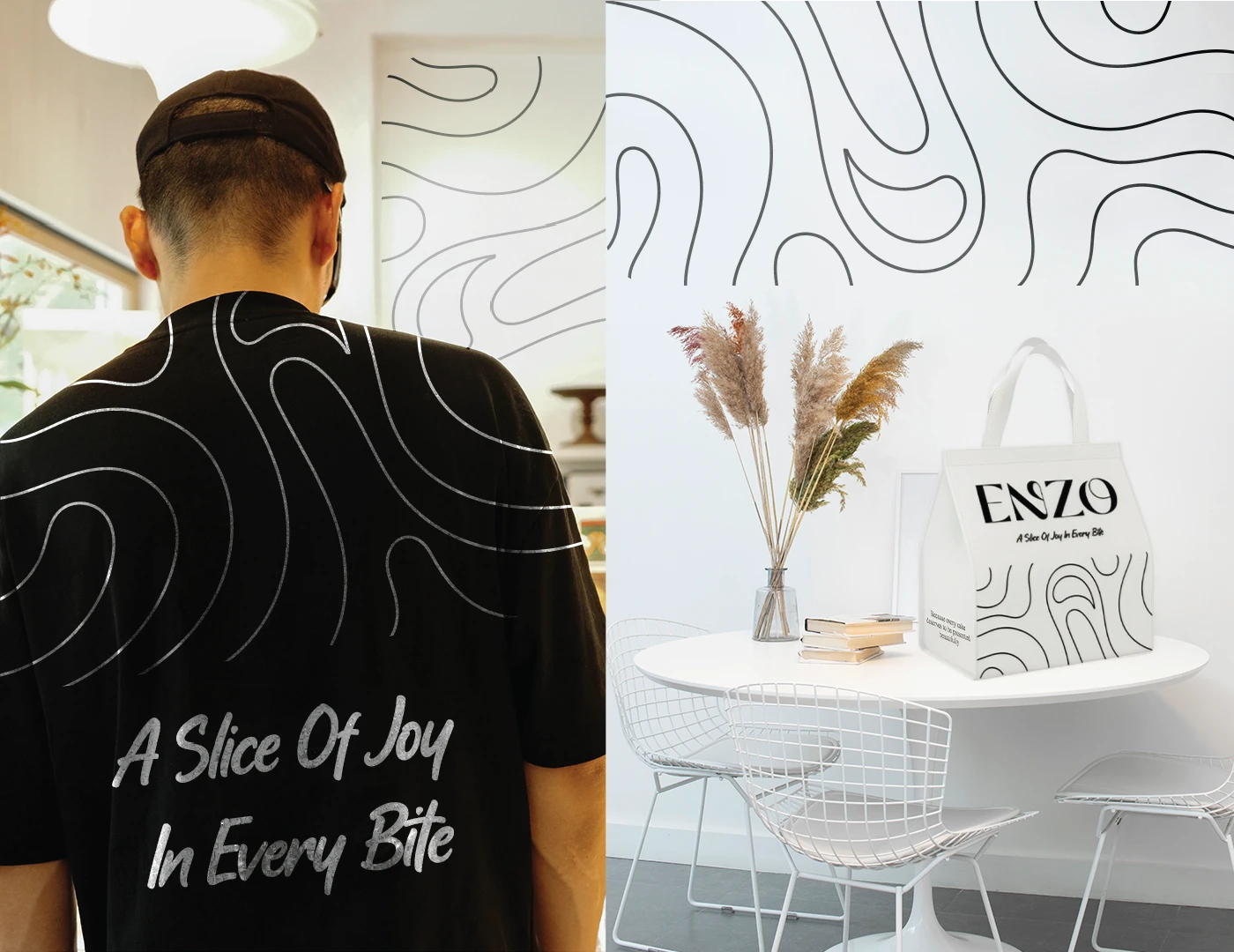
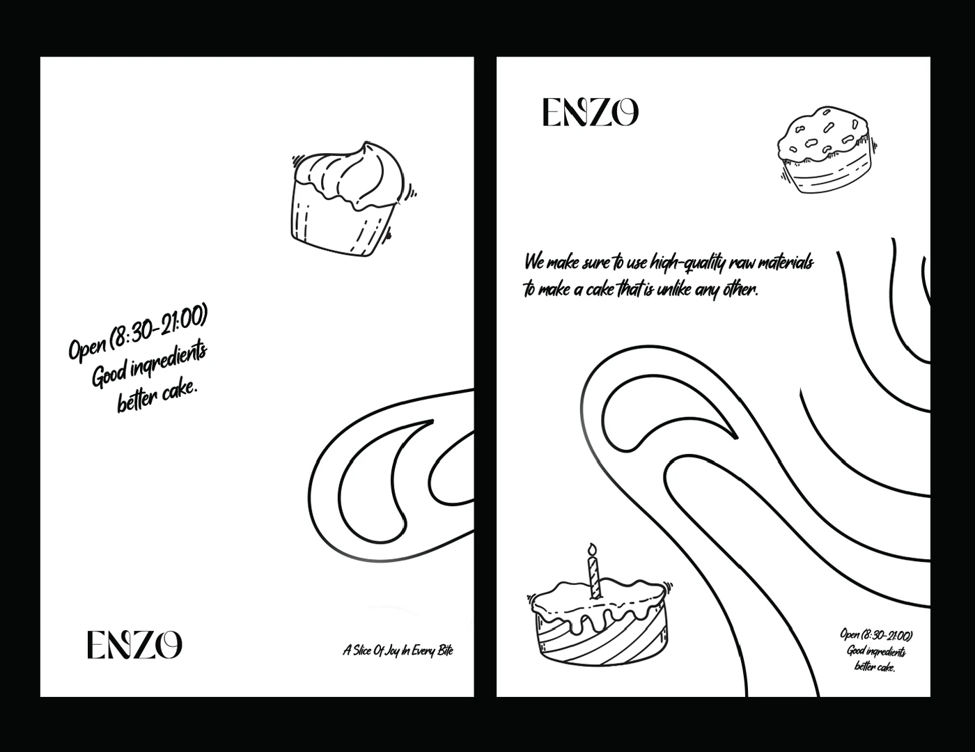
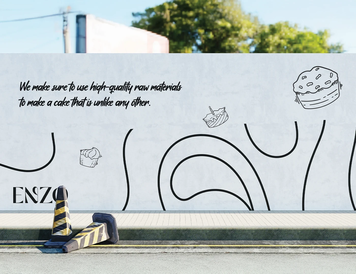
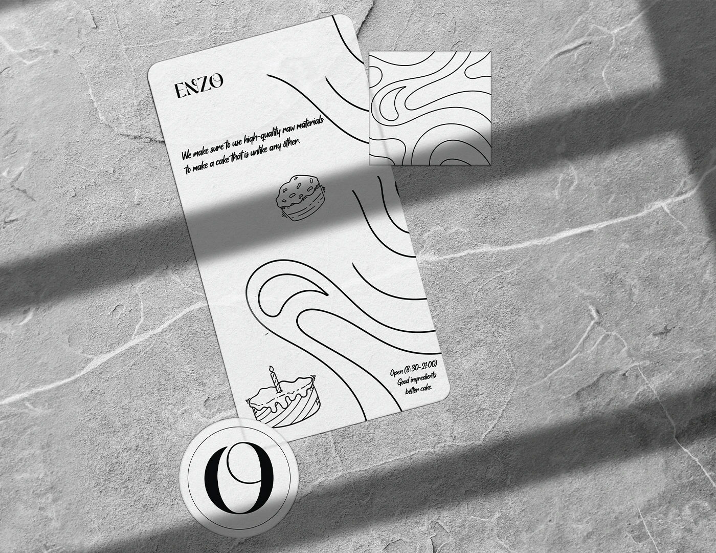
Extend the logo's fluid character into an organic line system across the identity
Use black and white to communicate classic luxury without competing with the product
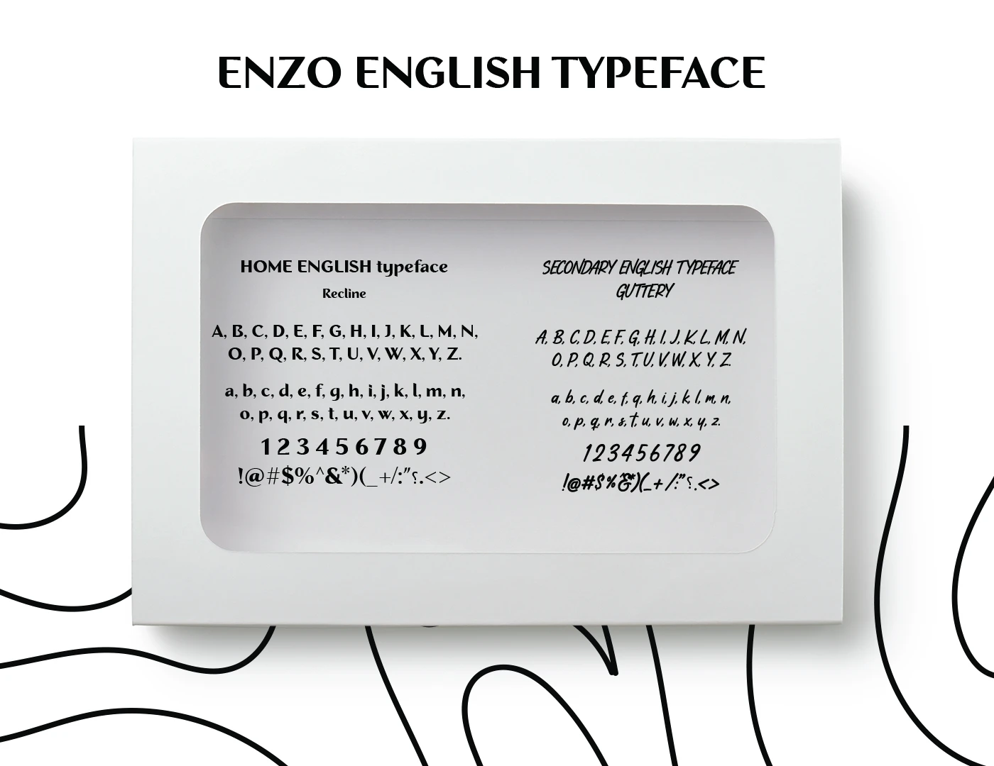
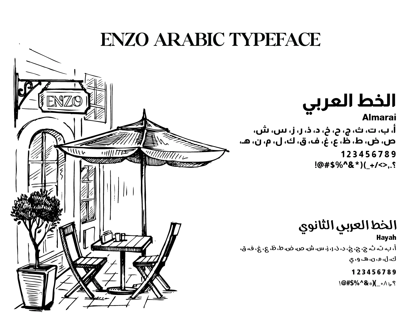
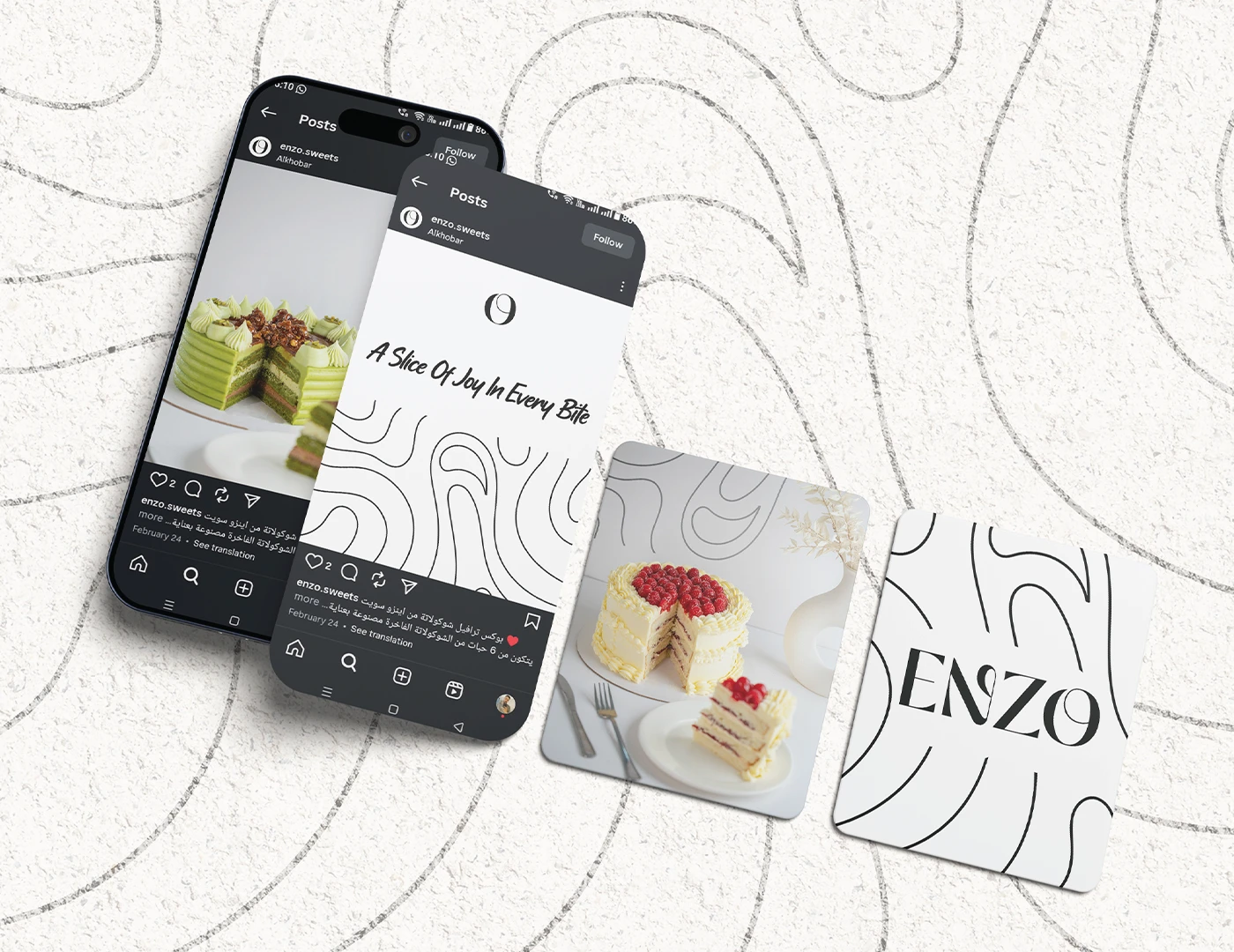
Keep English as the primary identity language and select an Arabic support typeface for social media
Retain deliberately rough, unfinished edges in selected dough-inspired forms to protect their handmade character
04Product, packaging & retail concepts
Frame the cake.
A luxury cake that reflects its owner.
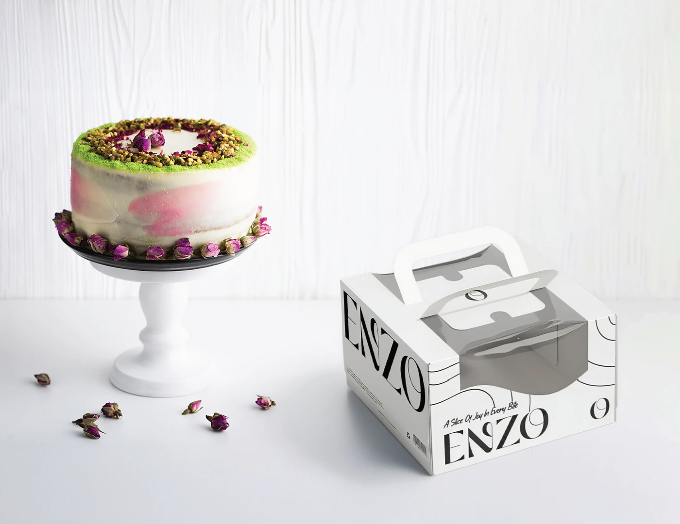
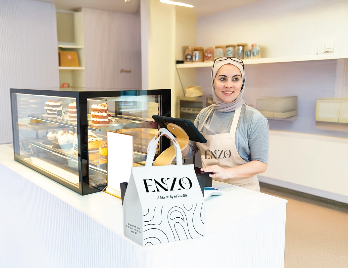
The opportunity was to move beyond selling another visually attractive cake and make ENZO a statement of personal taste. The rebrand brings customers closer to the craft behind the product while positioning the cake as part of how its owner enters and is remembered at an occasion.
The insight
A cake enters an occasion carrying something about the person who chose it. Beyond its appearance and ingredients, it can communicate their standards, personality and the impression they want to leave.
05Photography direction & applications
Direct the image. Carry it through.
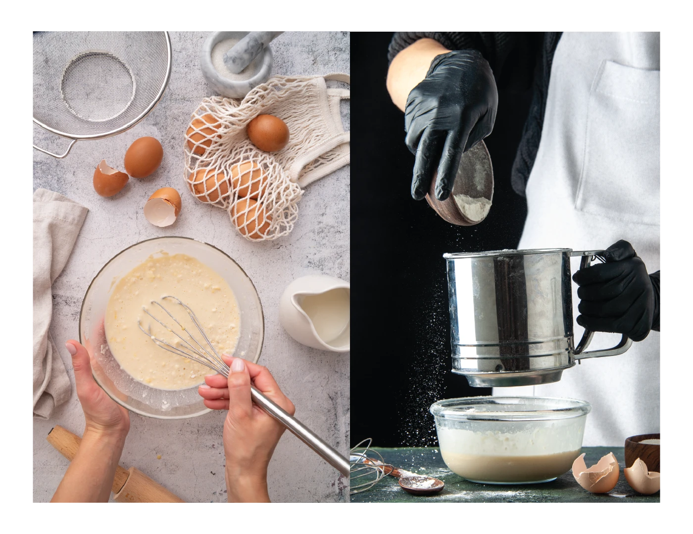
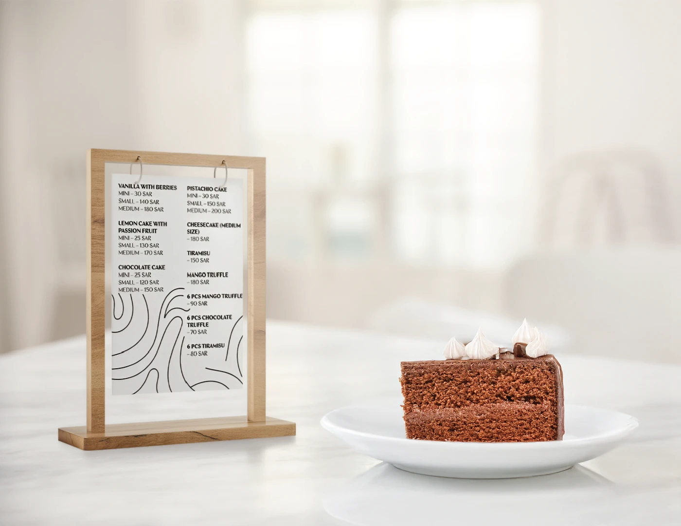
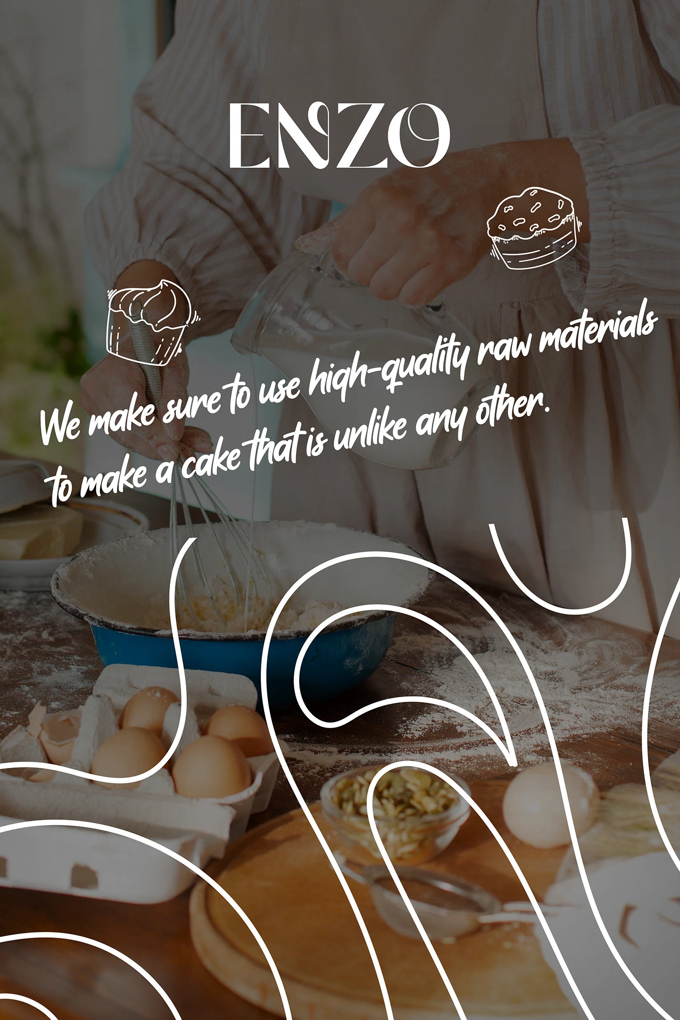
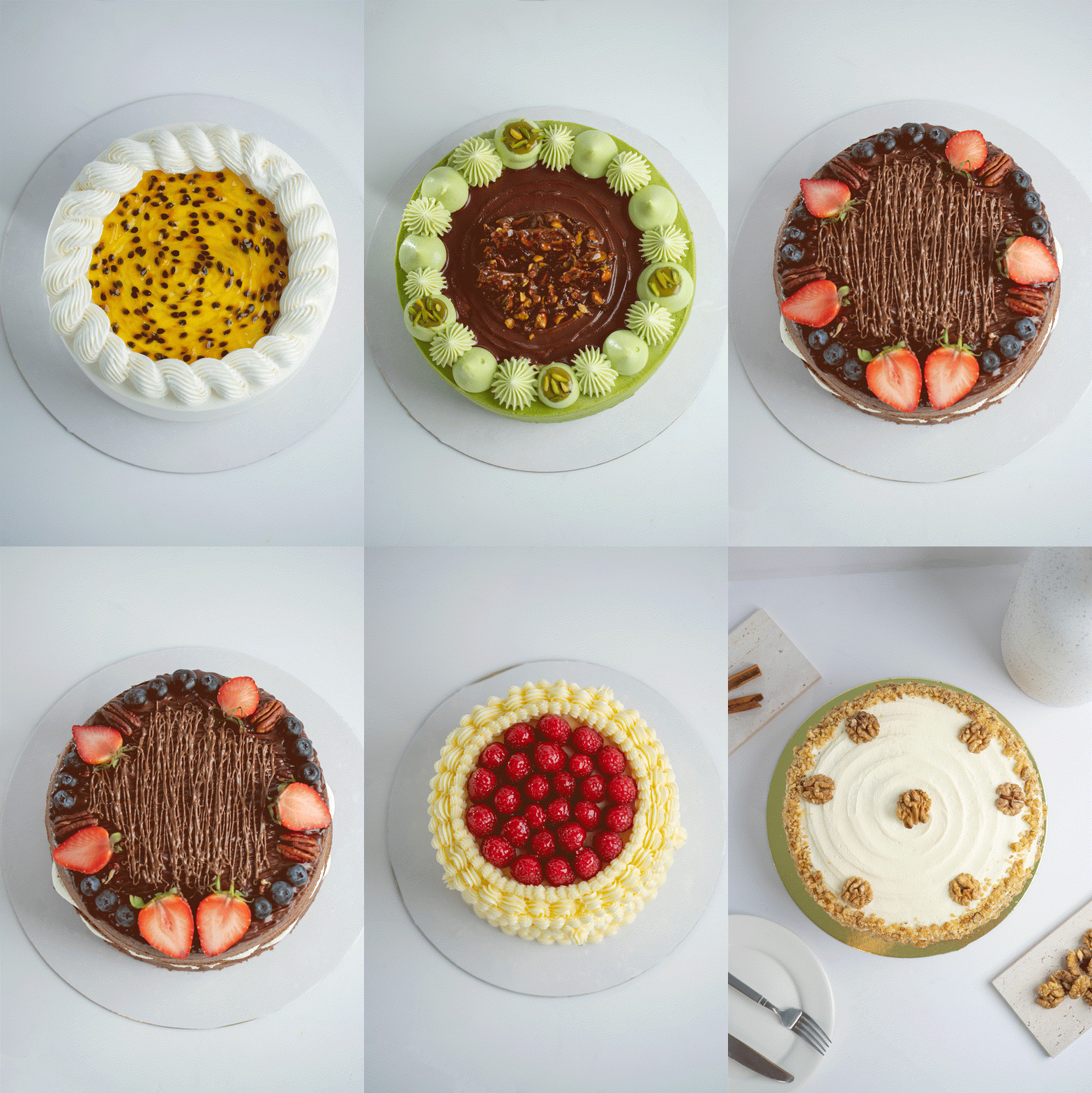
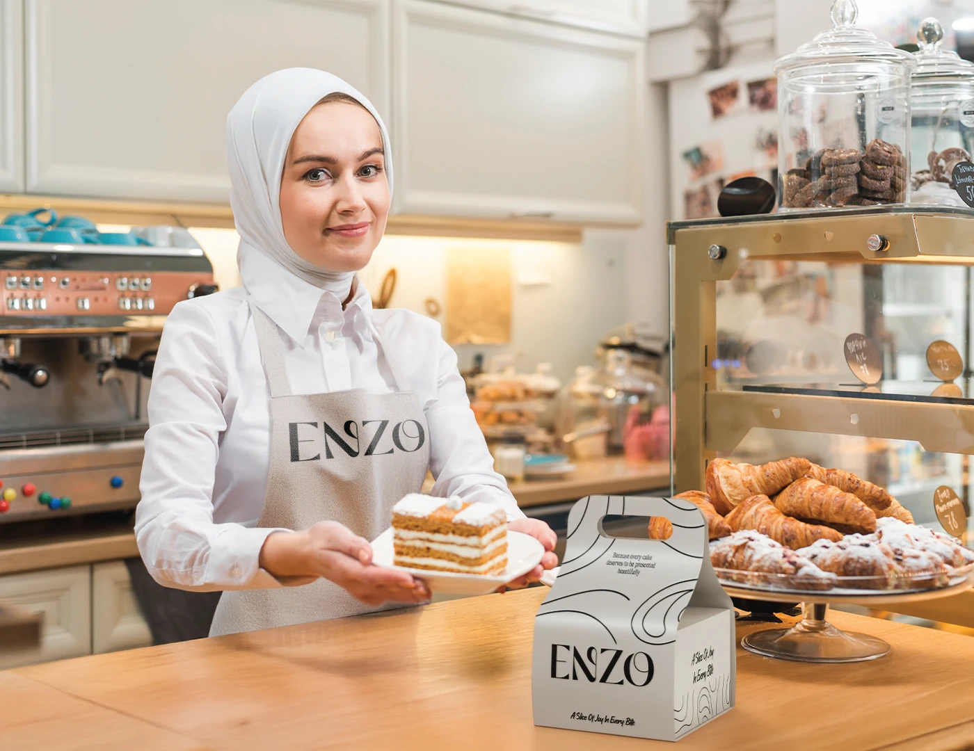
Art direct a real minimalist product photoshoot, then use its imagery across the design rollout
Role & creditsRole, scope and collaborators
My role
Independent Rebrand, Identity, Packaging & Photoshoot Art Direction
Researched the category and developed the rebrand positioning
Created the central idea and wrote 'A Slice of Joy in Every Bite'
Designed the logo, visual identity, pattern and illustration system
Selected the English typography and later the Arabic support typeface for social media
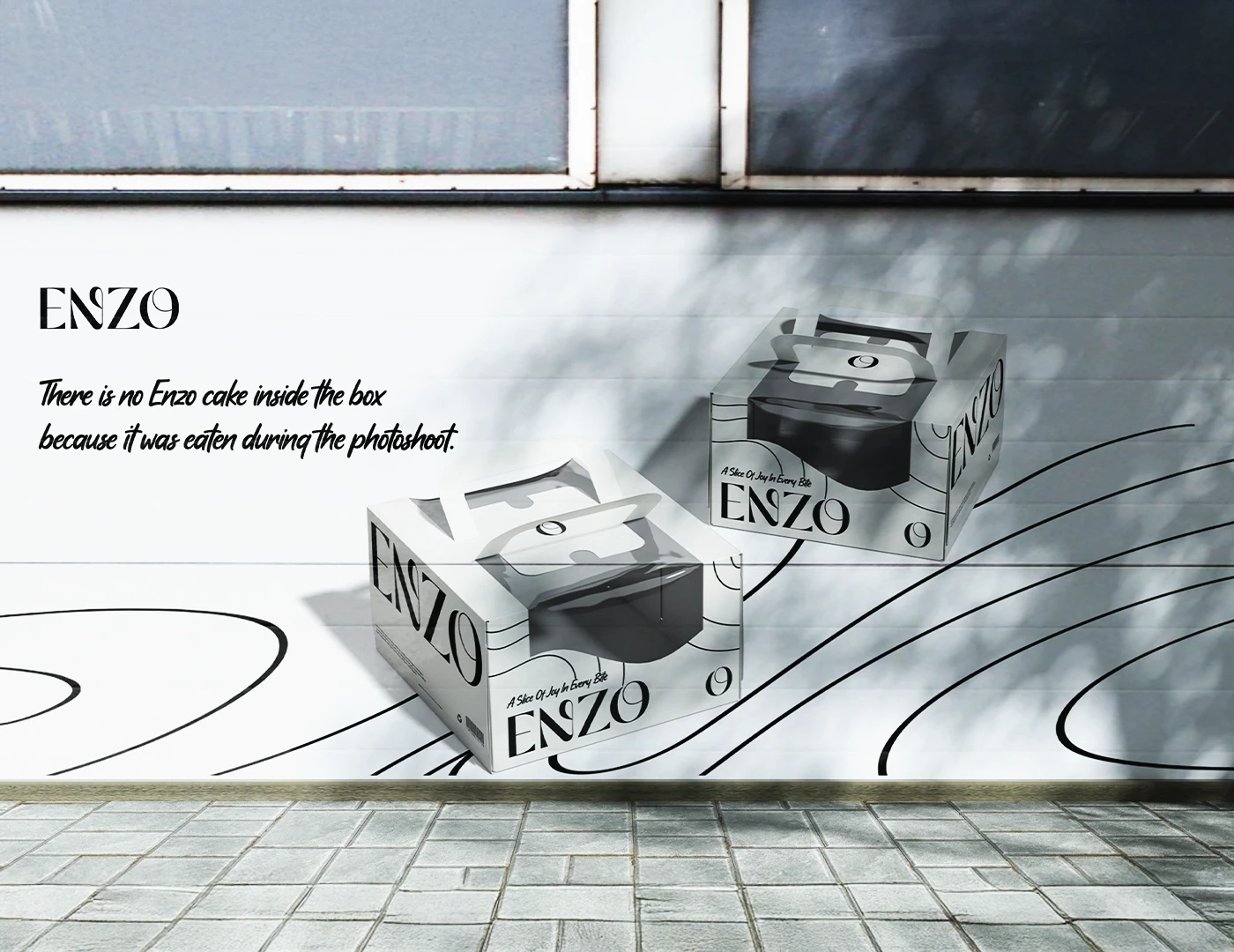
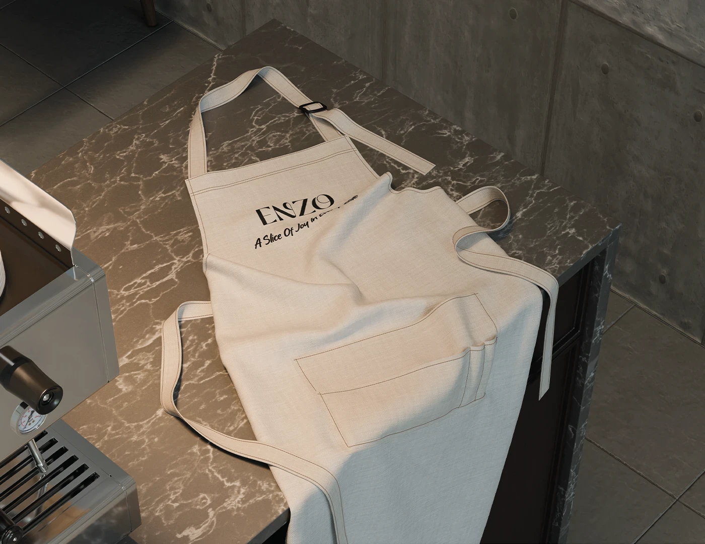
Designed the complete packaging system, mockups and brand applications
Art directed the real product photoshoot
Used the resulting photography to create the social media and visual rollout
Developed and delivered the project independently from concept to final presentation
Deliverables
Rebrand concept & positioning
Logo & visual identity
Original brand line
English typography & Arabic social support
Graphic pattern & illustrations
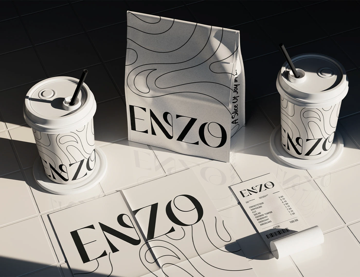
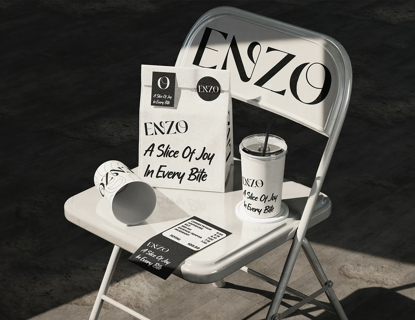
Cake packaging, bags & cups
Product photoshoot art direction
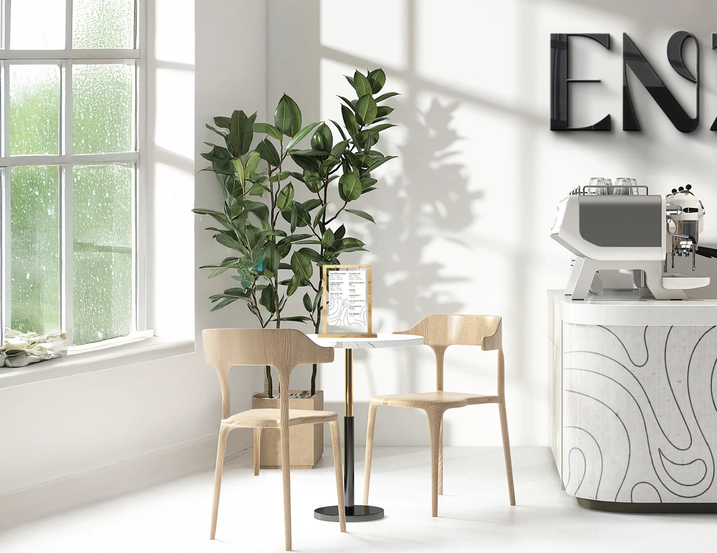
Social media & future retail applications
The complete rebrand was delivered to the client, most of the packaging was printed, and the identity is currently in use across ENZO's social media. The system also provides a foundation for the brand's future ambition to open a physical branch.
Selected credits
Independent Rebrand, Identity, Packaging & Photoshoot Art Direction