Brand identity & packagingCase 06

Flaré

Pop Art colour and retro illustration brought together in a food brand designed for a younger audience.
Brand
Flaré
Market
Jordan
Work period
2026
Portfolio release
2026
My role
Independent Art Direction, Brand Identity & Packaging
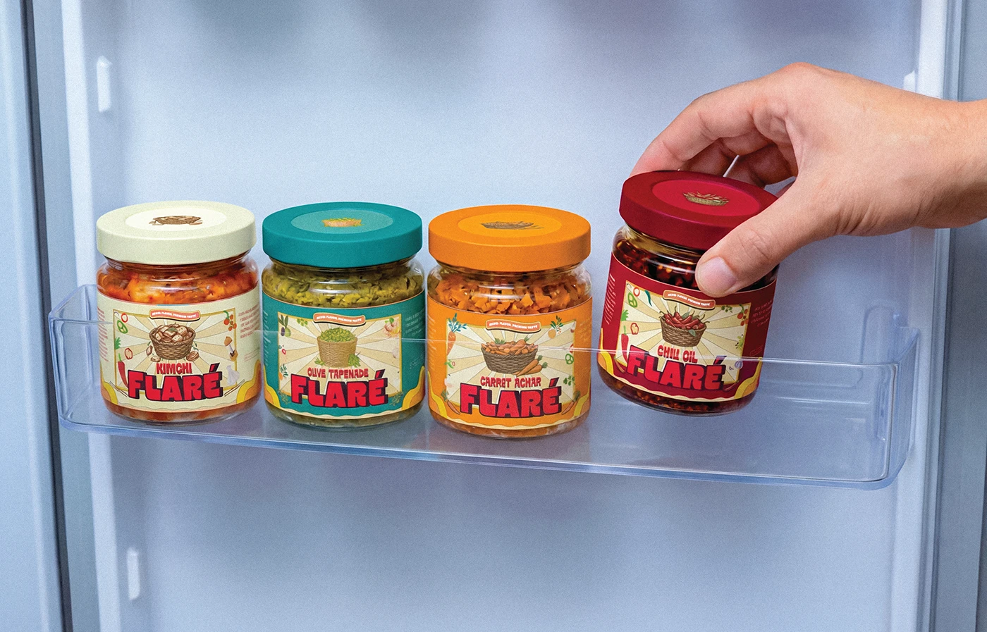
AI-generated presentation of Flaré's four jars in a fridge door, with a hand reaching for Chili Oil.
Project noteFood · Dips & spreads

Project note

Brief

Build an identity from scratch for four dips and spreads: Chili Oil, Kimchi, Olive Tapenade and Carrot Achar.

Target

The client wanted to attract young consumers, establish a strong presence on shelves and support sales through both retail and online channels. The positioning was mid-market, with the products presented in the brief as natural, preservative-free alternatives to conventional snacks.

Audience

Young consumers in Jordan, shopping online and in stores.

Challenge

The category was commonly presented as something that accompanies a meal and stays in the fridge between uses.

Insight

I wanted to give these jars a more visible place in young people’s lives: something to discover, share, take along and recognise on the shelf.

The work34 source pieces

01Concept, wordmark & illustration

Two influences, one visual language.

Rebel Flavor. Premium Taste.

The client selected the name Flaré with the idea of a spark that young consumers were looking for. I translated that intention into a bold, colourful identity. The direction needed to connect the ingredients inside the jars with the energy of the audience outside them.

Art direction

I combined Pop Art’s strong colour and graphic impact with retro illustration and packaging composition. The illustrated ingredients and backgrounds established the retro character. Bold lettering and contrasting colours gave the identity its more assertive presence. I established this direction through a moodboard and agreed it with the client before developing the identity.
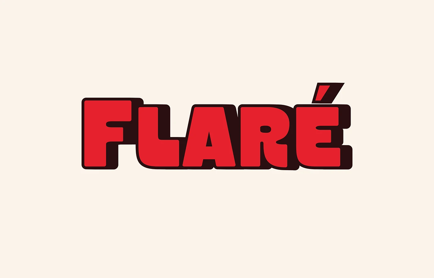
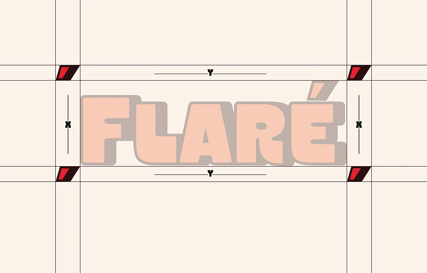
  • Flanky was the starting point for the logo. I modified the letterforms and redrew selected characters to create a bold, distinctive wordmark. On the labels, the logo and illustrations take the lead. Their scale and relationship carry the identity across the range.
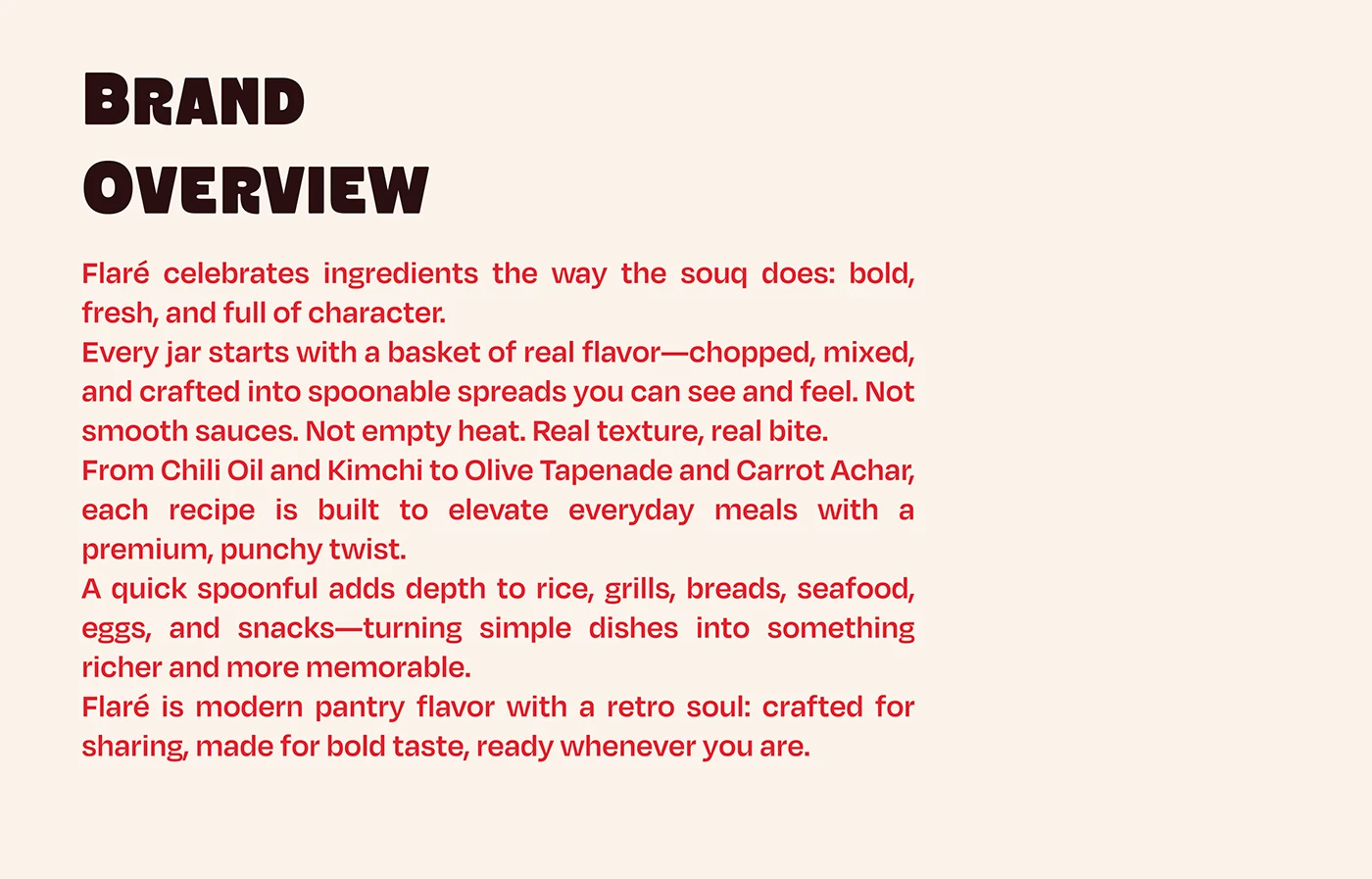
Flaré brand overview introducing the ingredient-led food range and retro visual character.
Red Flaré wordmark with a dark dimensional shadow on a cream background.
Flaré logo construction diagram showing clear space and letter proportions.

Animated series of original illustrated ingredient baskets for Kimchi, Chili Oil, Carrot Achar and Olive Tapenade.

02AI presentation imagery

Taking the identity into everyday scenes.

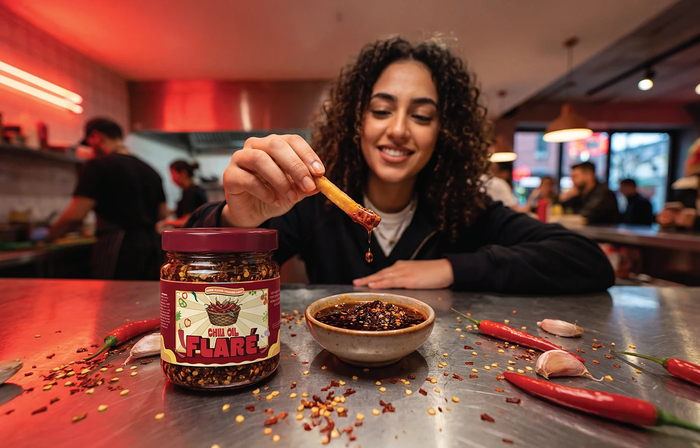
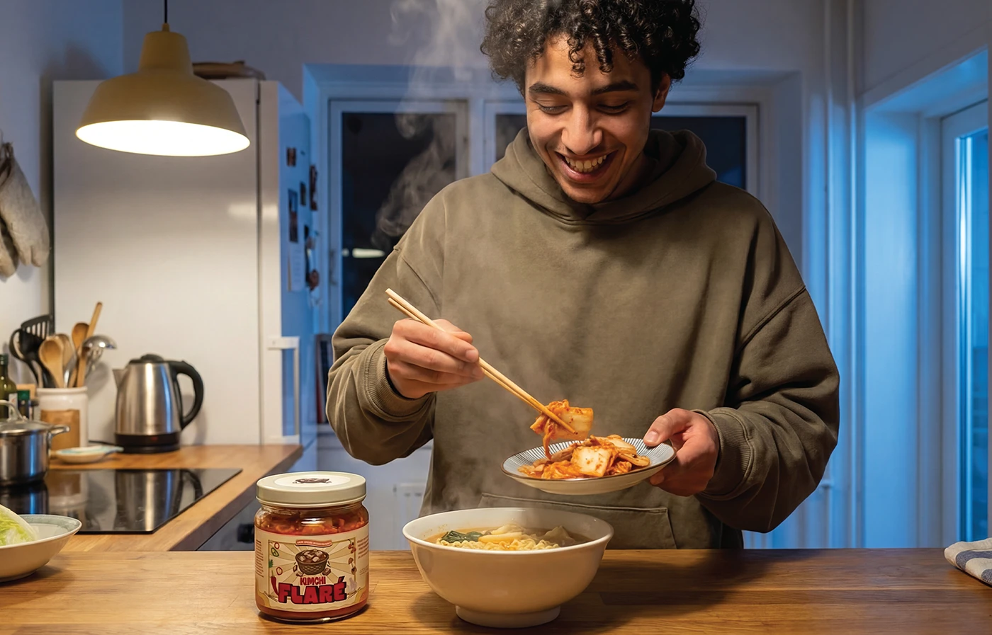
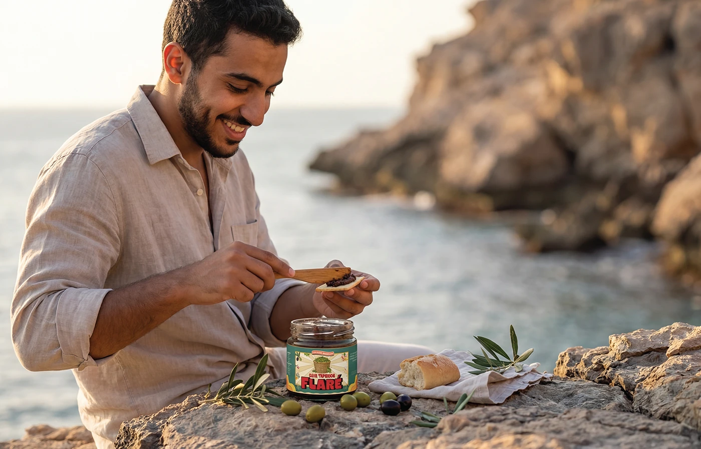
  • For the portfolio presentation, I developed product and lifestyle imagery using AI. The scenes place Flaré in kitchens, restaurants, trips and other activities associated with its intended audience.
AI-generated restaurant scene of a woman dipping a fry beside a Flaré Chili Oil jar.
AI-generated kitchen scene of a man serving food with Flaré Kimchi.
AI-generated outdoor picnic scene featuring Flaré Carrot Achar beside an open car.
AI-generated seaside scene of a man spreading Flaré Olive Tapenade on bread.

03Four flavours, one packaging system
Let the ingredients organise the range.

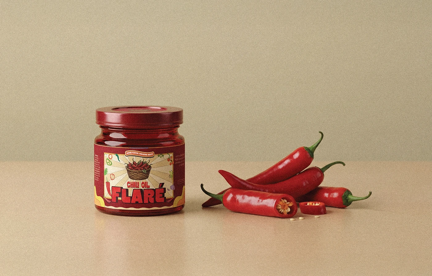
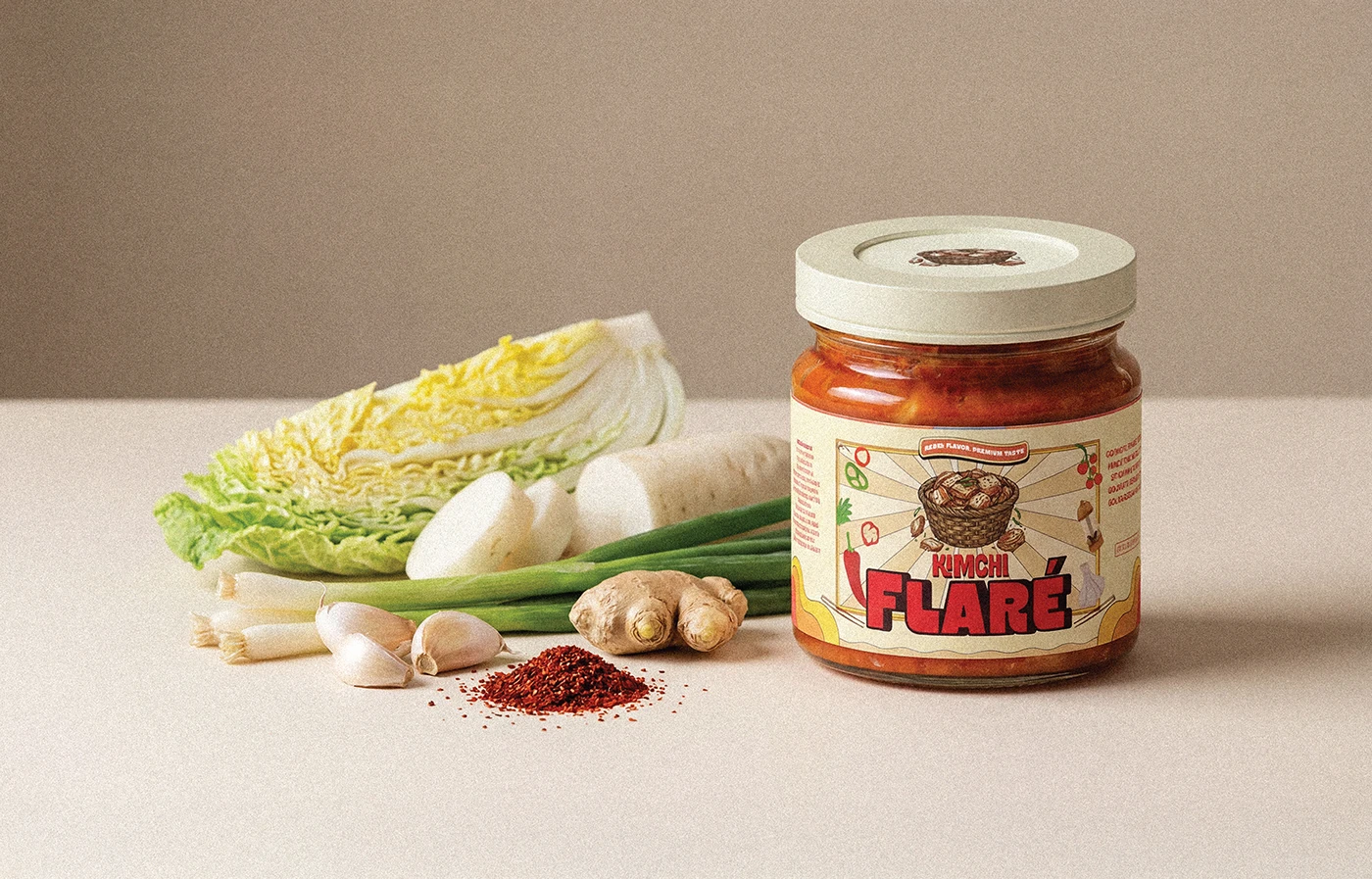
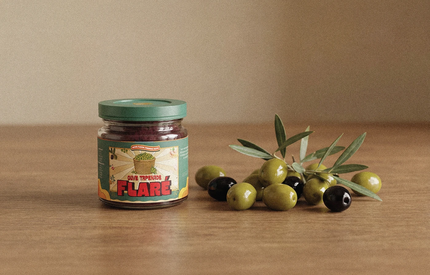
  • I created the ingredient illustrations in Illustrator to show what each product contains. The colours also come from the products themselves: orange for carrot, red for chili oil, and corresponding colours for the other varieties. This gives each jar its own identity within a consistent packaging system. The retro backgrounds and Pop Art colour remain connected across all four products.
  • I selected the jars, then developed the label layouts and dielines using the dimensions supplied by the client.
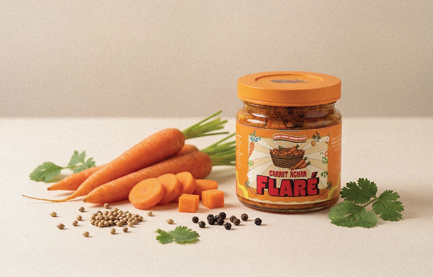
AI-generated product presentation of Flaré Carrot Achar with an orange lid, carrots and scattered spices.
AI-generated product presentation of Flaré Chili Oil with a red lid beside red chilies.
AI-generated product presentation of Flaré Kimchi with a cream lid, cabbage, garlic and other ingredients.
AI-generated product presentation of Flaré Olive Tapenade with a green lid beside olives and an olive branch.

04Bags & the two-jar gift box

Packaging for sharing.

  • I also designed a gift box holding two jars, allowing different flavours to be shared between friends. That packaging was produced. The gift format extends the concept beyond an individual purchase into a social occasion.
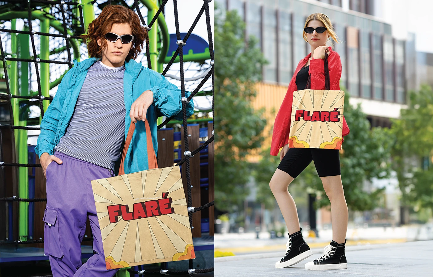
Two street-style presentation scenes featuring Flaré branded shopping bags.

05Objects, advertising & social explorations
Extending the identity.

  • Bags, stickers, advertising and social applications explore how the identity could appear across those settings. These additional applications were developed for the presentation.
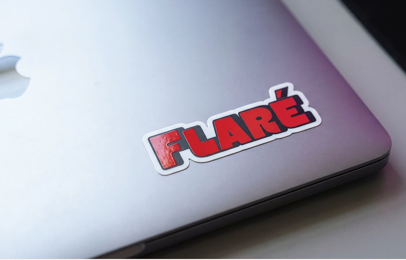
Flaré wordmark sticker applied to the corner of a laptop.
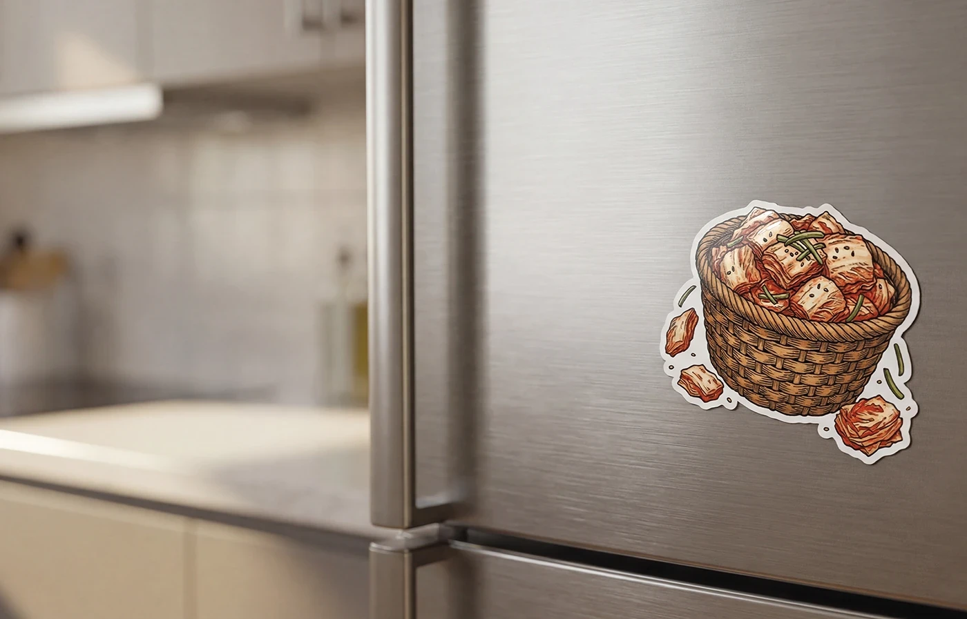
Kimchi ingredient-basket illustration presented as a sticker on a fridge.
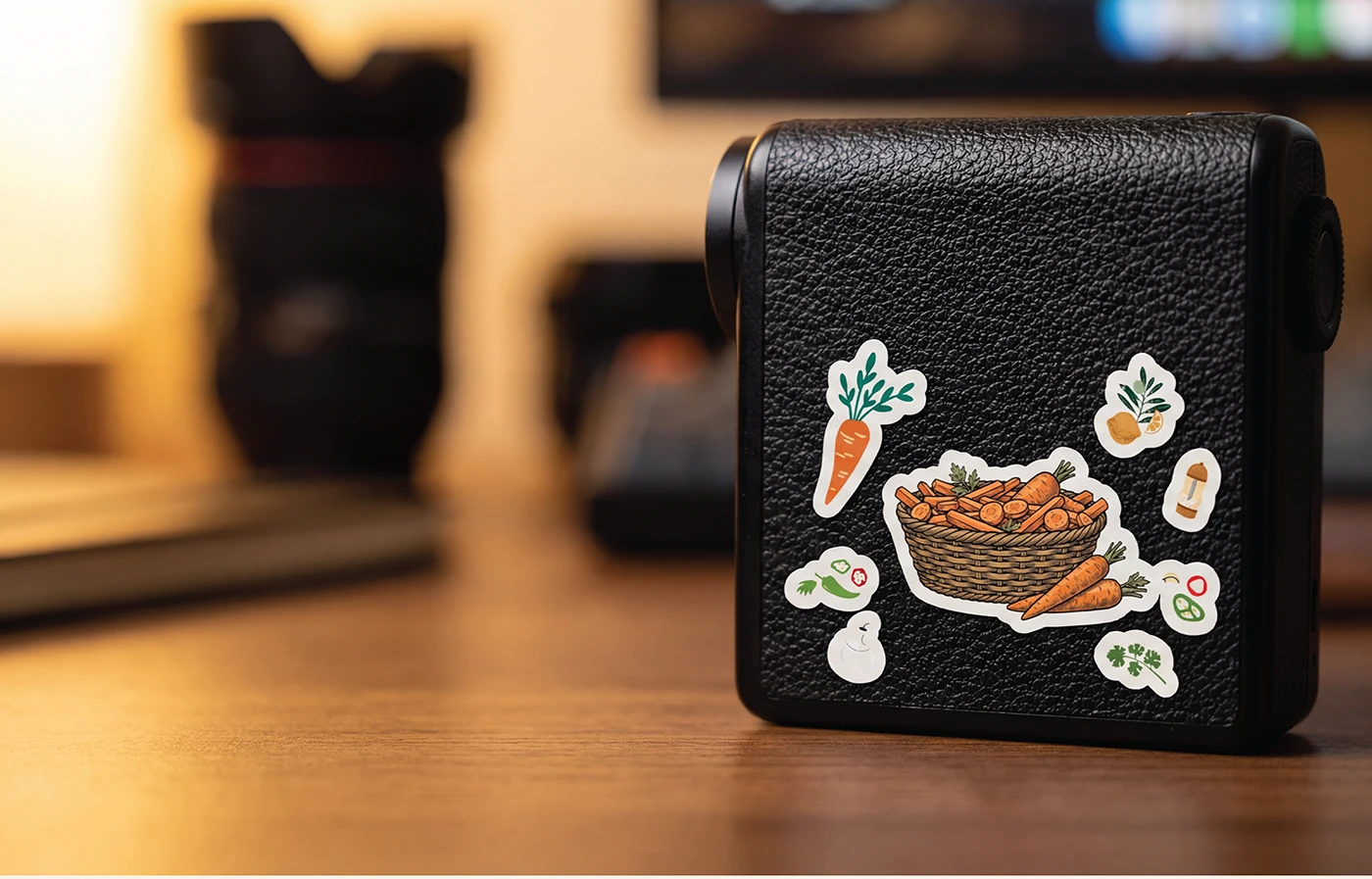
Carrot ingredient-basket illustration and individual ingredient stickers on a black case.
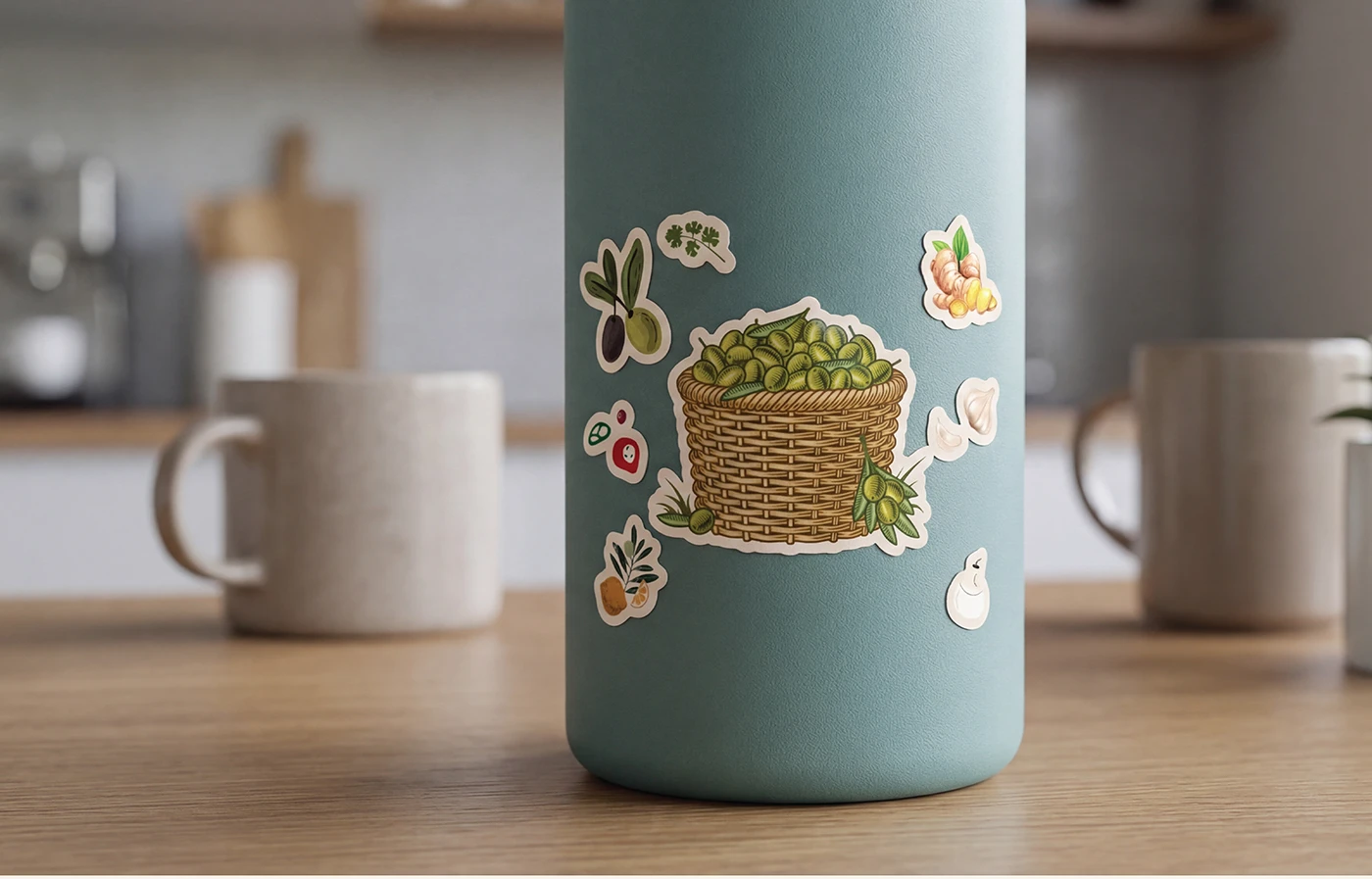
Olive ingredient-basket illustration and matching ingredient stickers on a reusable bottle.
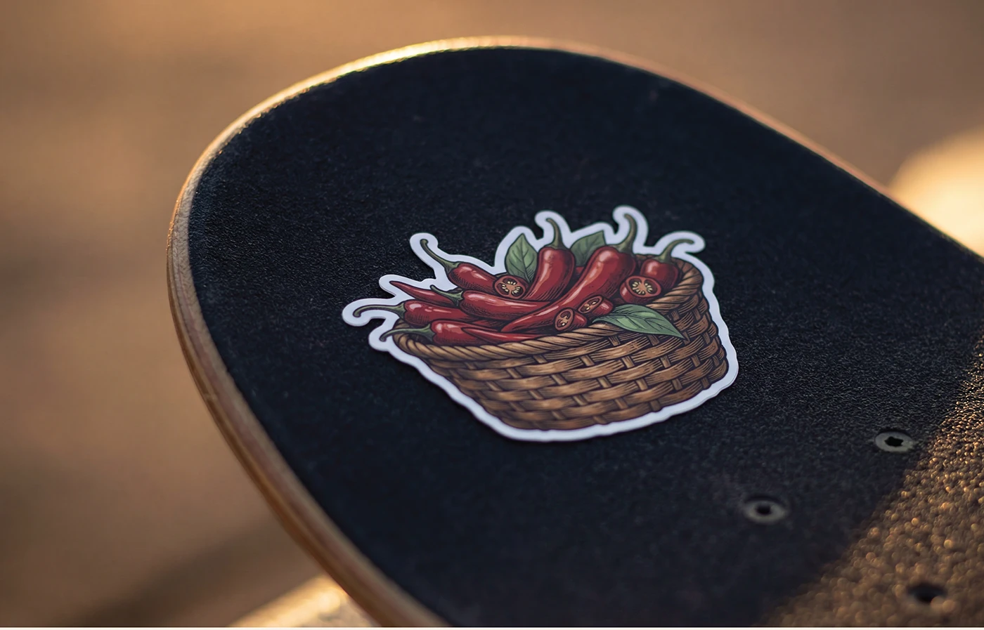
Chili ingredient-basket sticker on a skateboard deck.
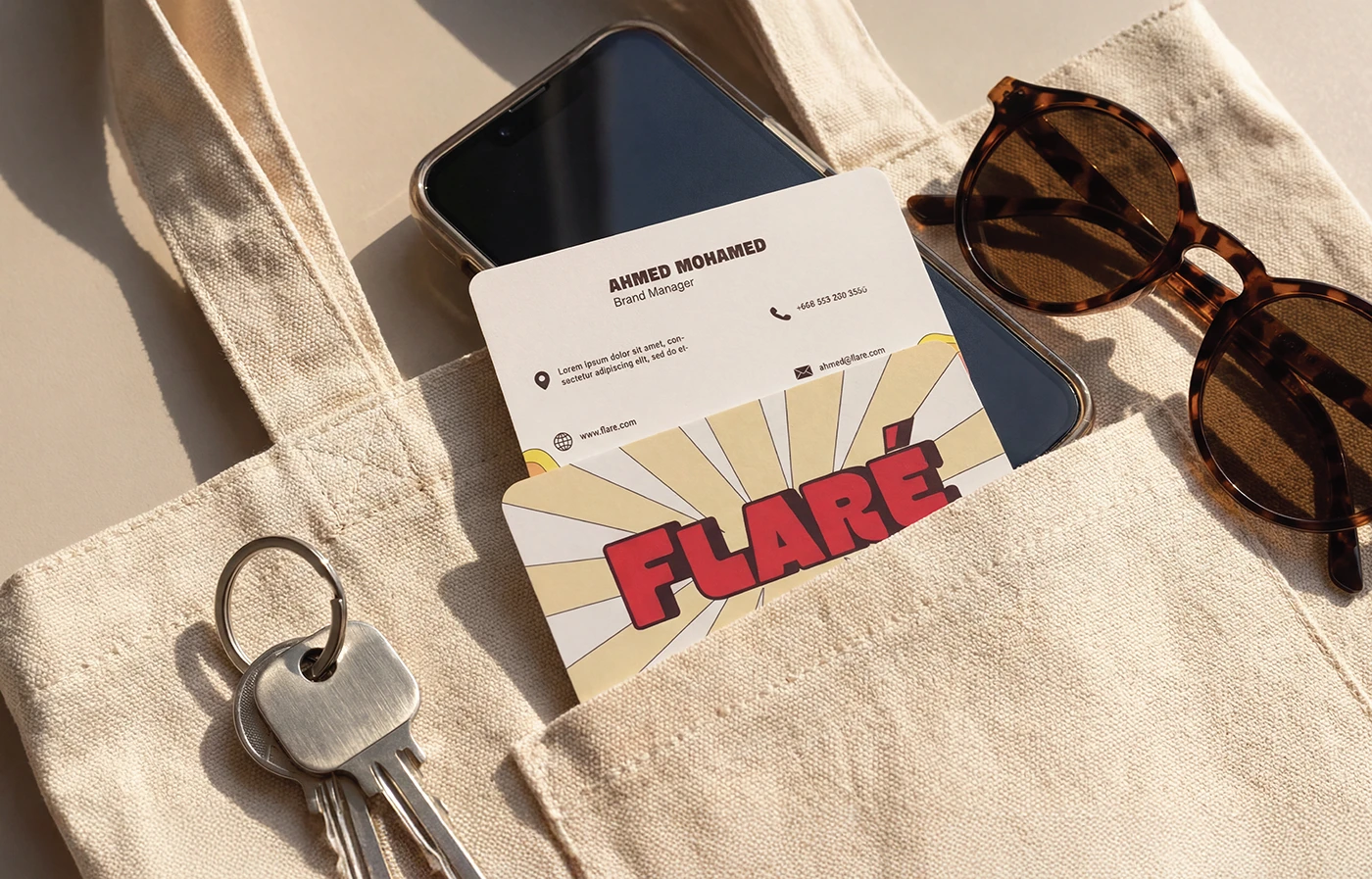
Flaré business card presentation with a cream tote bag, phone, keys and sunglasses.
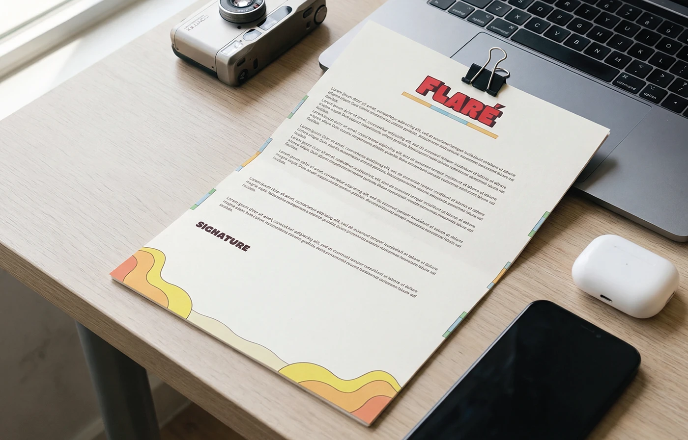
Flaré letterhead presentation on a desk beside a laptop and camera.
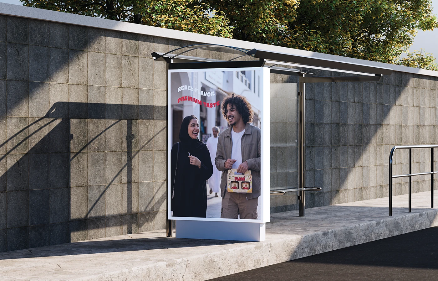
Bus-shelter advertising concept showing two people carrying a Flaré gift box.
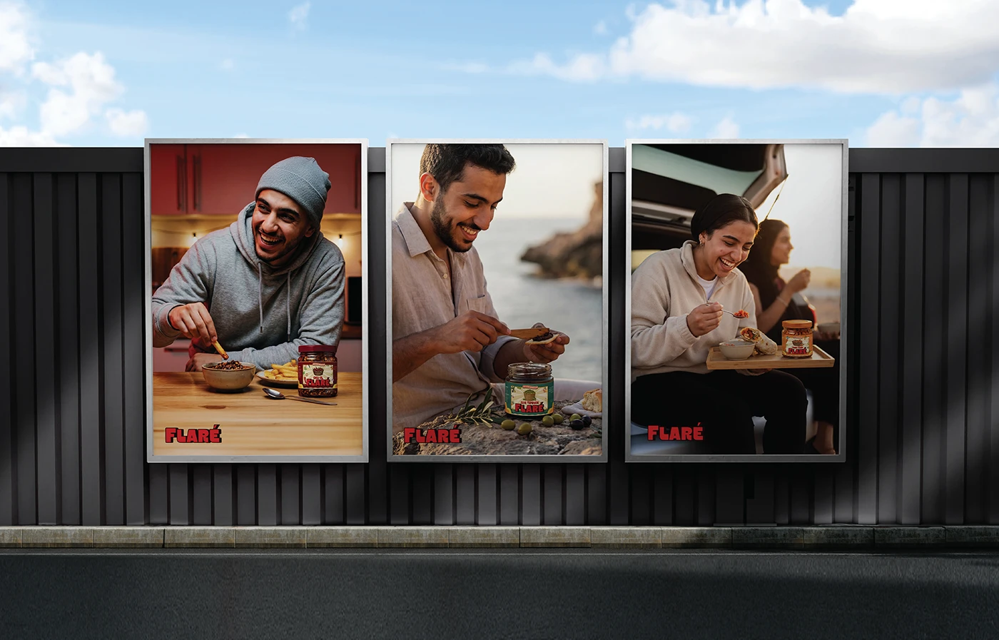
Three outdoor poster concepts showing Flaré in restaurant, seaside and travel settings.
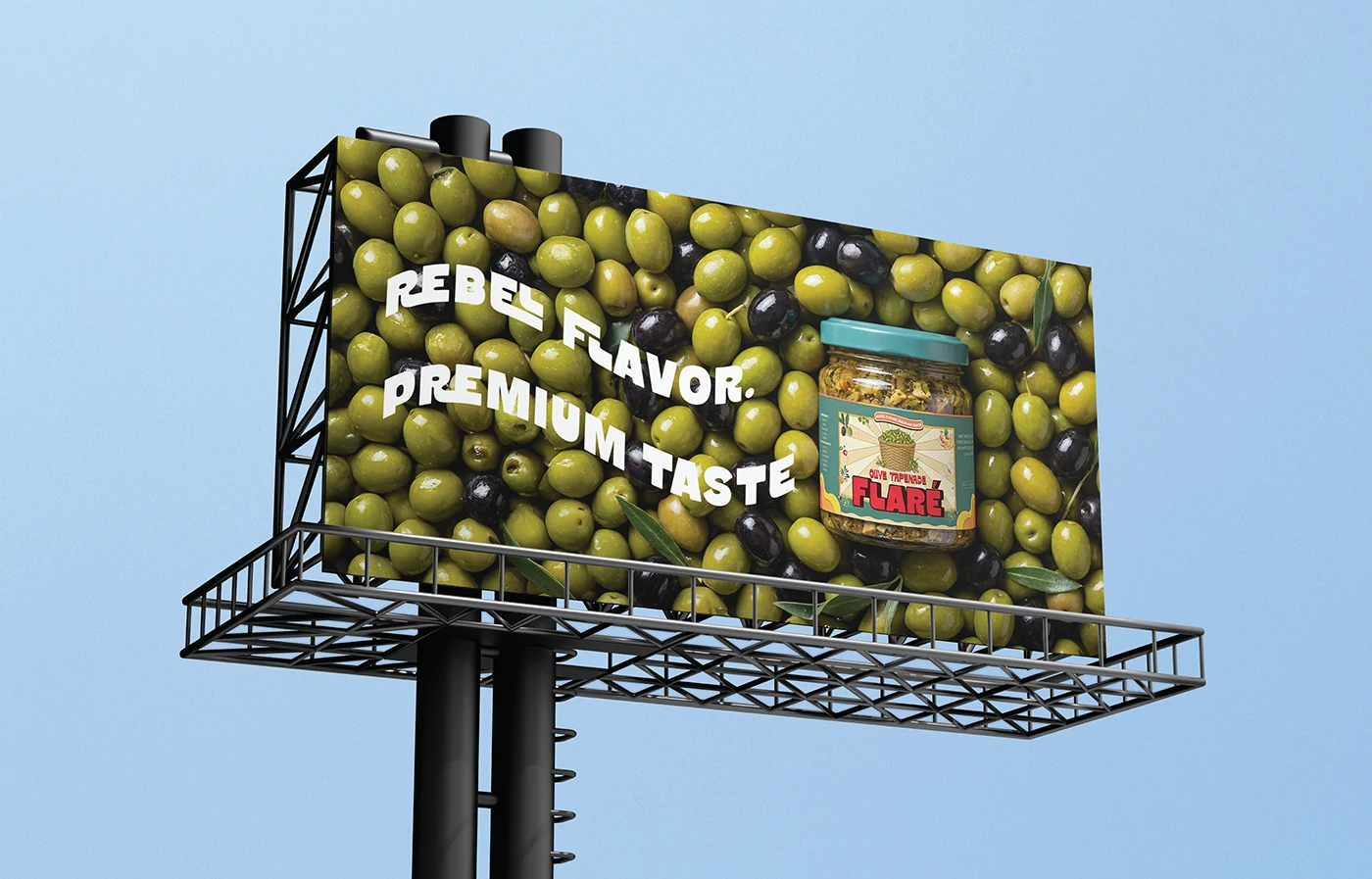
Olive Tapenade billboard concept with a field of olives and the line Rebel Flavor. Premium Taste.
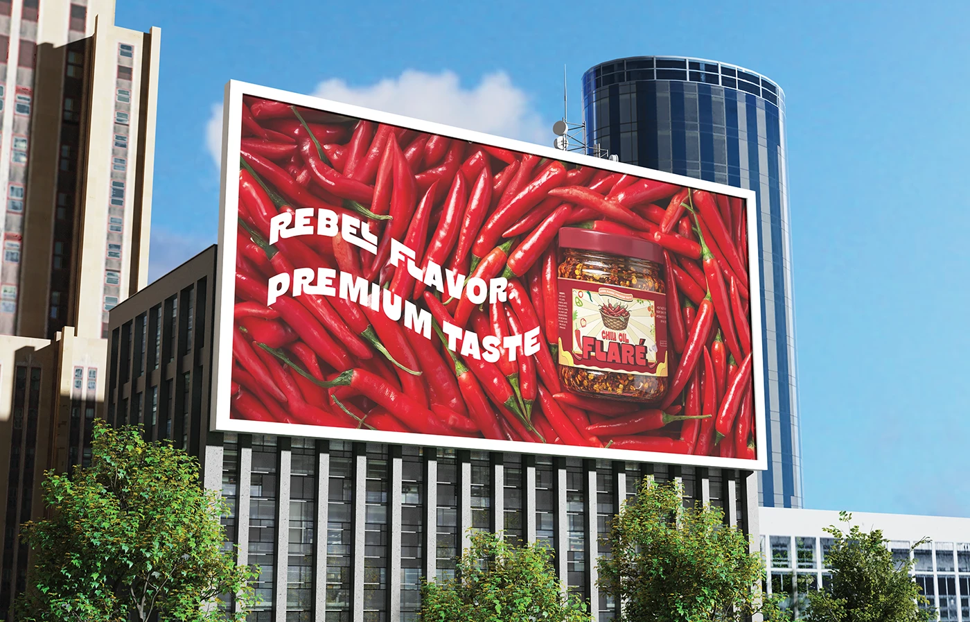
Chili Oil billboard concept with red chilies and the line Rebel Flavor. Premium Taste.
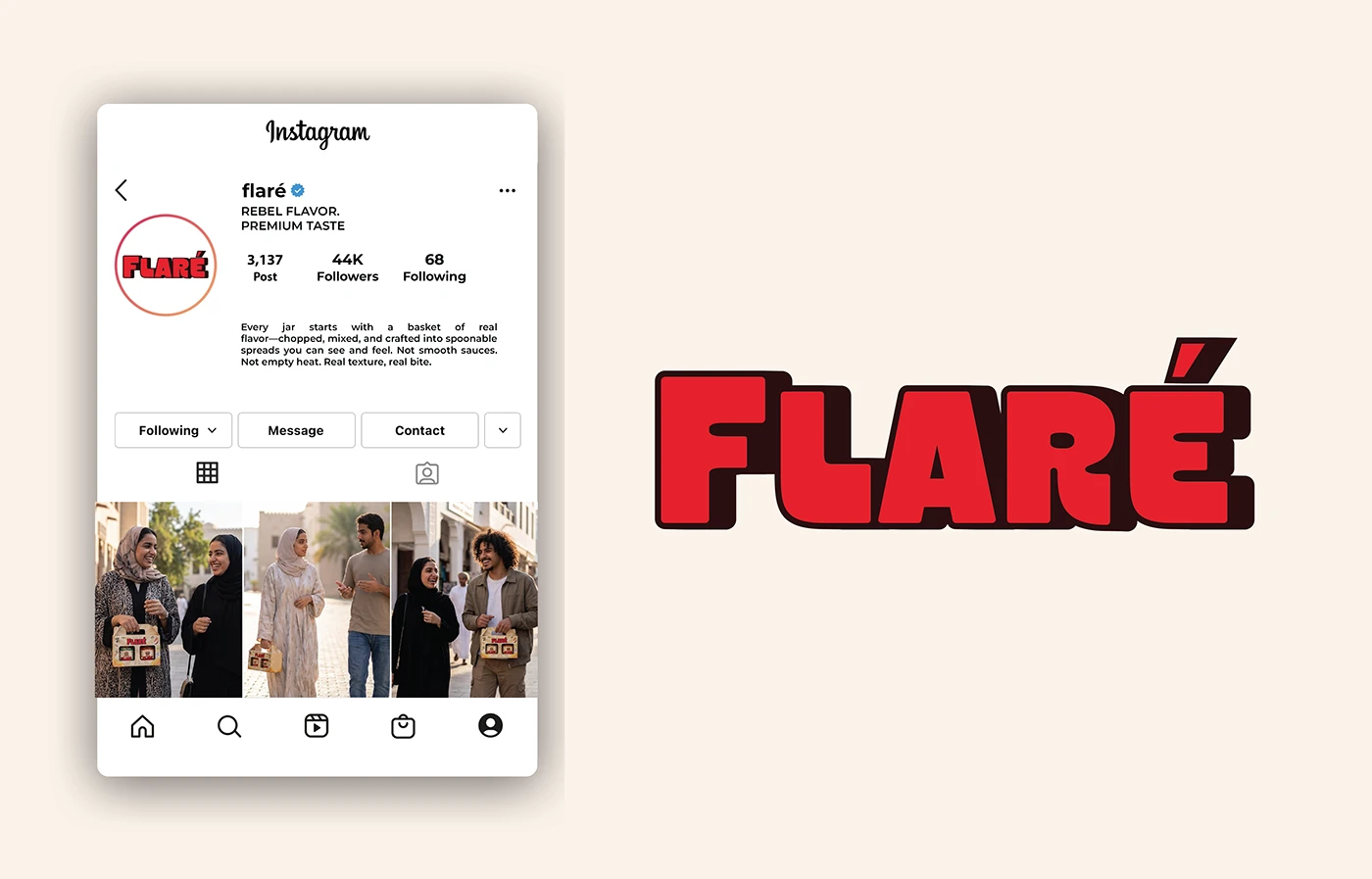
Proposed Flaré Instagram profile layout beside the red brand wordmark.
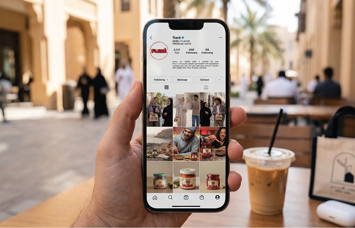
Flaré Instagram profile presentation on a phone in an outdoor café setting.
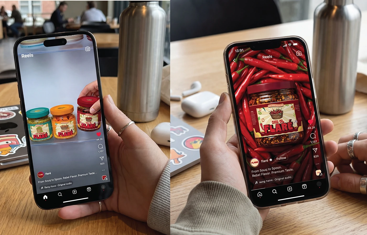
Two phone presentations showing Flaré product imagery in Instagram Reels layouts.
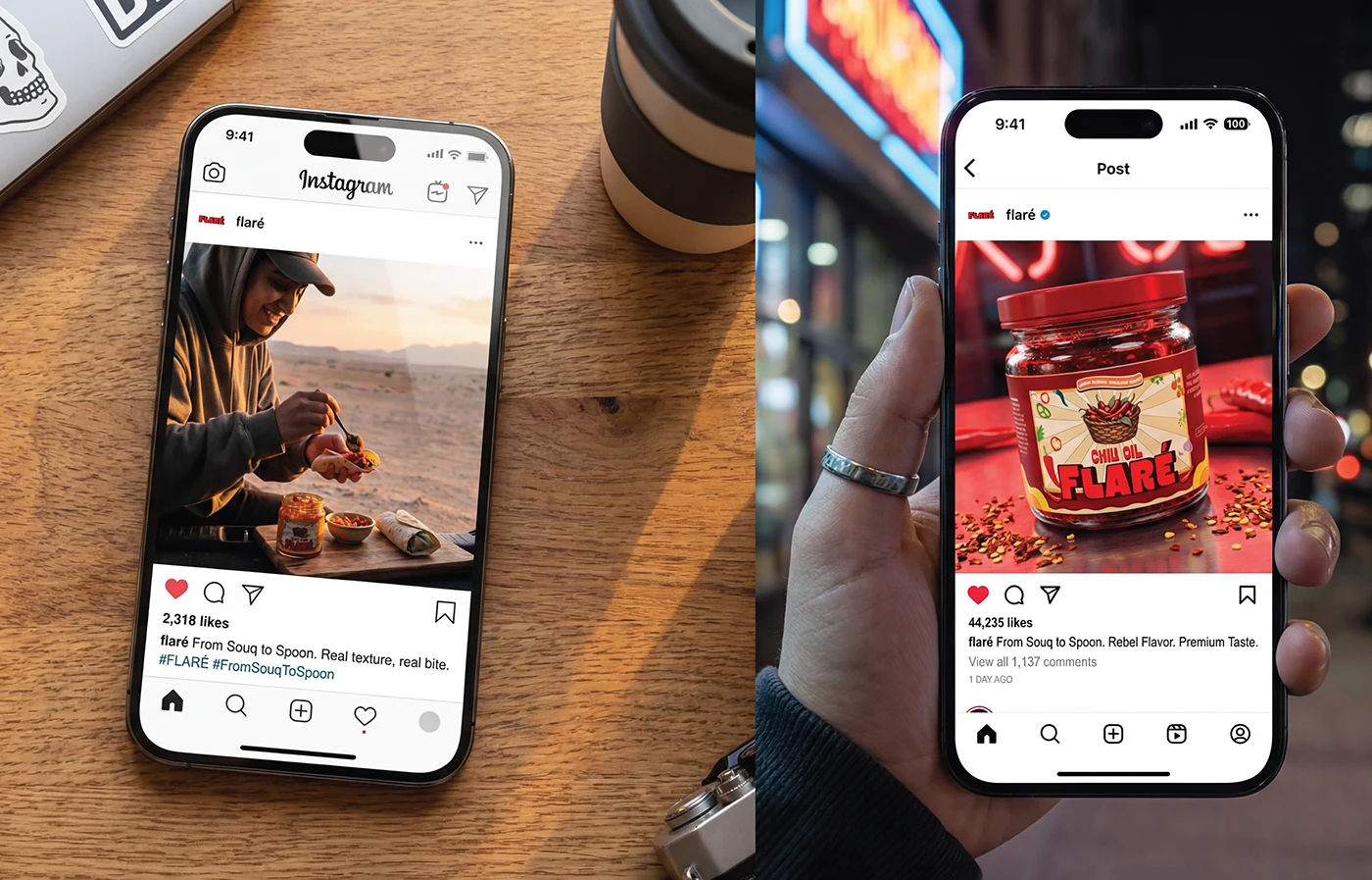
Two Instagram post presentations featuring outdoor snacking and Flaré Chili Oil.
Closing thank-you artwork in bold retro lettering on a cream background.
Role & creditsRole, scope and collaborators
My role

Independent Art Direction, Brand Identity & Packaging

  • I worked independently across the visual concept, logo, lettering adjustments, illustrations, colour palette, typography, packaging, dielines and presentation imagery.
  • The project shows how I combine artistic influences into a consistent direction, then carry that direction through products, compositions and brand applications.
Deliverables
  • Brand identity & lettering
  • Ingredient illustrations
  • Colour palette & typography
  • Jar labels & dielines
  • Two-jar gift box
  • AI presentation imagery & applications

The complete brand work was delivered to the client. Production of the two-jar gift box is confirmed. Product and lifestyle imagery shown in this case study was created using AI.

Selected credits
Art Direction, Brand Identity, Illustration & Packaging
Ahmed Sallam

Have a project worth making properly?

yasas77889@gmail.com ↗