Core idea
Healthy food can be loud.
Healthy food could have a loud visual presence while keeping its purpose clear.
Fresh Diet makes fresh, healthier versions of familiar favourites. I developed the brand from the ground up, giving it a bold, expressive identity built around the energy of the young people it wanted to reach.

Core idea
Healthy food could have a loud visual presence while keeping its purpose clear.
Create a colourful, youthful identity for a new healthy-food brand. The client wanted movement and personality, with a visual language that would connect with Gen Z and make the food feel exciting.
Young people interested in fitness, diet and healthy eating—people who wanted enjoyable food that fitted their routines, and a brand they could see themselves in.
The perception I wanted to challenge was that healthy food had to feel dull, clinical or compulsory. The opportunity was to make it feel like an appealing everyday choice: fresh food with appetite, freedom and personality.
Before developing the identity, I researched references and presented several moodboards to the client. We agreed on the visual direction first, establishing a clear foundation for the design work and its applications.
01Naming & identity
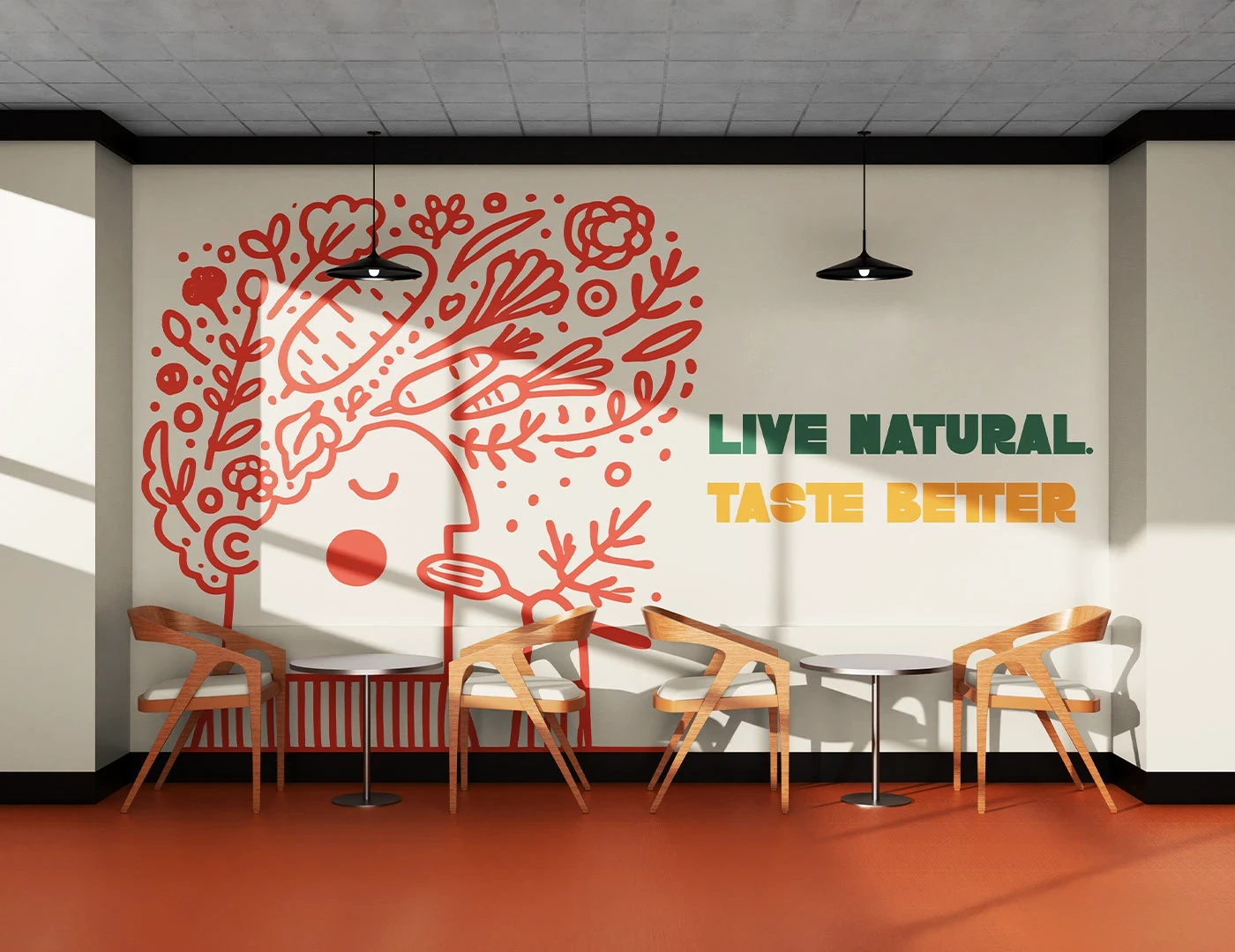
I proposed the name Fresh Diet and wrote “Live natural. Taste better.” Both were approved by the client, establishing the name and message around which I built the identity. I deliberately chose thick, heavy lettering. It gave the name confidence and created the contrast needed for the central idea: a slender “I” within the bold wordmark. That single letter carries the reference to diet. The surrounding typography gives the brand its youthful presence. The concept lives inside the lettering itself.


02Colour, type & illustration
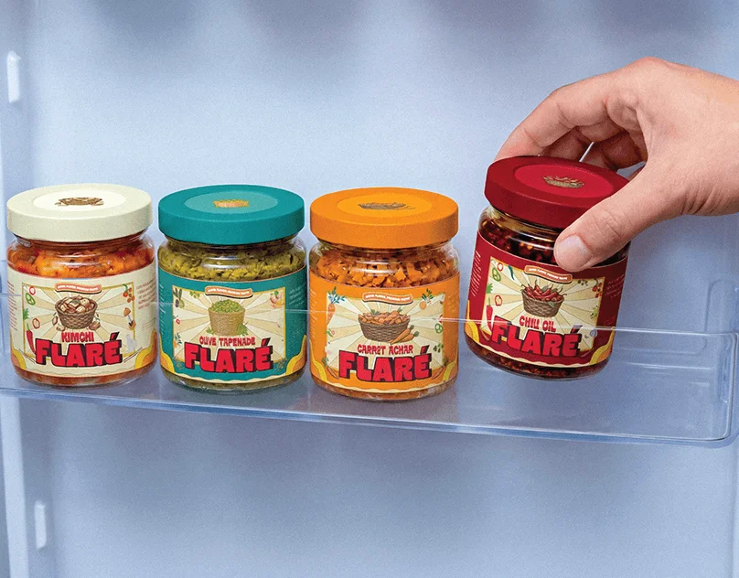
Green and orange brought together freshness and vibrancy. Bold typography carried that energy across the identity, while vector illustrations gave the food a playful, expressive character. I developed the illustration direction using a combination of elements I drew and selected existing assets. Across the packaging, product-specific illustrations kept each application lively while connecting it to the same recognisable brand.




03The identity in use
Packaging became a major expression of the brand. I brought the wordmark, colours and illustrations together in compositions that made the identity immediately visible across different products.


04Across the brand
My work extended through the packaging artwork, dimensions and dielines, alongside social media templates and a digital menu. The visual direction had to hold together wherever customers encountered Fresh Diet.


I worked independently across naming, slogan writing, concept development, art direction and design. I created the logo, selected the colours and typography, developed the illustration system, and delivered the packaging, mockups, social templates and digital menu.
The client implemented the identity and its applications, including the packaging. The work moved into real use, carrying the same bold direction from the original concept through the finished brand.
Have a project worth making properly?
yasas77889@gmail.com ↗